Decoration
4 Tips for Matching Your Paint Colour to Your Wallpaper
4 Tips for Matching Your Paint Colour to Your Wallpaper
Whether your wallpaper covers a feature wall or is only pasted on one side of panelling or a dado rail, creating a sense of cohesion between the two different elements is one of the trickier parts of decorating.
For most people, a neutral paint palette represents the safest course. Those easy-to-please beiges, whites, and creams are the most obvious complement to a bolder, brighter or busier wallpaper, but there’s only so much pleasure one can take from picking out yet another neutral.
So, if you’re looking to find a strong match for your wallpaper without erring on the side of beige, this one is for you…
1. Don’t focus on finding a perfect match
This is something that a lot of people start out doing but, more often than not, they discover that it’s a lot harder than they first thought. Finding a similar shade of green, blue, pink – whatever colour you’re looking for – will be easy. In fact, it will be too easy.
It’s a tale as old as time that, after a comprehensive sweep of the paint shop, someone will get home with what appears to be the perfect match to their wallpaper, only to find that it’s ever so slightly different. And, as you can imagine, that ever so slight difference turns out to be a lot more disruptive – and a lot less cohesive – than an intentionally contrasting colour would be.
The moral of the story? Unless you’re choosing wallpaper for a minimalistic space and intentionally going for that monochromatic look – a ‘green room’, for instance – having two almost-identical shades of one colour is apt to look like a mistake, rather than an intentional design choice.
2. Instead, create a colour palette around your wallpaper’s main colour
This isn’t an exact science, and, once created, it’s not something that you should feel compelled to stick to rigidly as you decorate the rest of the room. Instead, it’s a useful way of creating a guide – something that should, ideally, help steer you in the direction of the ideal contrasting colour.
For this, you’ll want to settle on your wallpaper’s primary colour, then focus on finding five or six colours that either contrast with that primary colour or offer a different shade of that original colour. Again, you don’t want those different shades to be too close to the original – instead, aim for plenty of difference in hue and tone.
For contrasting colours, the colour wheel is a good place to start. Orange contrasts effectively with blue and green, for instance, but not so well with yellow or red. Clashing can be impactful, but it ought to be done intentionally, rather than accidentally.
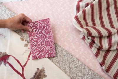
For this, you’ll want to take advantage of your wallpaper samples and experiment with different combinations until you hit upon something that works.
3. Whatever you choose, try to aim for a difference in hue
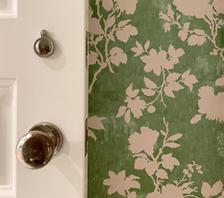
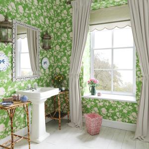
This is one of the most helpful tips for anyone to learn when they’re just getting used to colour stories and theory. Even if you have two highly complementary colours from opposite ends of the colour wheel – for instance, the seventies-favourite pink and green – then pairing a pale, dusty pastel pink with a brighter, deeper green will generally prove more effective than two pastels, or two vivid shades.
True, there are exceptions, but, unless you’re going for a ‘pastel theme’ or the opposite, then it’s best to focus on maintaining that variation.
4. Remember that you’re in charge of making (or breaking) the rules
Colour palettes and schemes are great. The results of a carefully curated colour scheme can be really impactful and make a genuine statement that captures the eye as soon as you walk in the room.
Then again, the opposite can be true – and there’s absolutely no use in tying yourself to arbitrary rules unless you genuinely, really want to create a room with a very clear, very intentional colour palette. It can curb your creativity, and make it a lot harder for you to get anywhere with your décor, since you’ll spend the entire time worrying about ‘breaking code’ and undermining your own vision.
Contrast can be key to a lot of design elements – some of which you might want to integrate – like zoning a room with wallpaper, or making a small recess into a feature.
So, ultimately, the final choice lies with you. Are you 100% committed to your colour scheme, or happy and willing to be a little looser and a little less restricted to the colours you introduce into the space?
The phrase ‘matching colours’ is quite open-ended – and for good reason. To some people, matching one colour to another will be a case of finding the absolute perfect hue, with not even the slightest different in tone or shade between them. For others, it will be a case of simply finding a colour that looks good alongside another. Start by working out where you want to be on that spectrum, and work from there.
More from Decoration
