Decoration
How to Use Bold Patterned Wallpaper in a Small Space
How to Use Bold Patterned Wallpaper in a Small Space
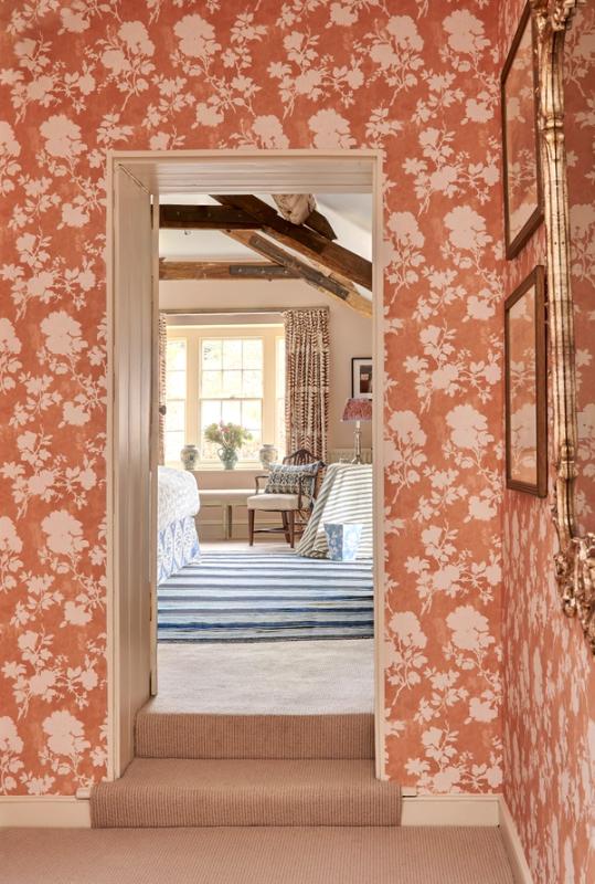
We’ve all heard it: the original, written-in-stone rules of interior design. ‘Don’t add décor in even numbers’, ‘Don’t paint ceilings using dark colours’, and absolutely, positively ‘Do not overwhelm a small space with a bold or ‘busy’ print’.
Like most of these rules, learning how to break it effectively is pretty much the key to making a statement. Standout interior design can be conventional or it can be daring – or, our favourite, it can be a blend of the two. The key is to cherry-pick which rules you follow, and which rules you flout.
It’s not an exact science, but that’s part of the charm.
First, why not?
The general line of thinking is that bold or so-called ‘busy’ prints ought to be reserved for bigger spaces – spaces that offer a large enough canvas for the pattern to stand out without making the room feel overloaded. Just as interior designers tend to avoid giving a small room a very large chandelier, for instance, or cramming as many items of furniture as possible onto the floorspace available, they advise against covering limited wall space with too much pattern.
It's understandable, but, unlike the other two examples we just listed, patterned wallpaper has one key advantage: it doesn’t take up any more physical space than a plain, painted wall.
Plus, making a room feel as big and bright as possible isn’t the only ambition of the interior designer, amateur or professional. Rooms can be beautifully confined, cosily small, and pleasantly closed-off from the rest of the home, and that’s part of the charm of creating a unique home. You can even use wallpaper to spruce up an alcove, and turn it into a feature, no matter how small it is.
So, for that reason, here are a few different ways to use bold patterns in small spaces, without creating a room that looks like it’s breaking any rules.
Tentative or Maximalist?
Feature walls – or even just the chimney breast – are two favourites of the more tentative interior designer. They give you the perfect opportunity to incorporate print into the room, rather than centring the entire room around that print – something which can feel more manageable in smaller rooms. This technique does do valuable work breaking up colour(s) or a theme, but can, in some instances, feel like a concession.
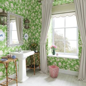
But that’s not to say that the complete opposite approach can’t work for smaller rooms too. Going above and beyond with wallpaper is a choice for powder rooms, or any particularly small spaces that want to be features, rather than ‘little extras’.
Wallpapering not just the walls but the ceiling too may sound like an eccentric creative choice reserved for Tim Burton or Wes Anderson films – stylised for its own sake –, you’d be surprised how effective it can be. For this, there’s no use holding yourself back in terms of print or colour, since you’re already doing the absolute most, so pick the boldest print you like. Hang a couple of contrasting prints on the wall to break it up a little, but don’t go overboard, and make sure your lighting is as good as it can be to prevent the walls from feeling like they’re closing in.
The organic flowing patterns, like our Phoebe wallpaper create a sense of flow – one that will draw the eye up, and from one end of the room to the other.
Wallpapering the ceiling as well as the walls is the antithesis to using your paper to create a feature, but there is plenty of opportunity to develop contrast and tonal shifts with lighting tricks. Positioning wall lamps and ceiling fixtures to throw shadow and light in arranged manners can shift the atmosphere.
Half Wall or Full Wall?
This one applies whether you’re creating a feature or papering all four walls, since there is always the option to ‘concentrate’ your wallpaper into smaller space within any wall you’ve chosen to decorate.
Panelling and dado rails are both seeing a lot of popularity in interior design at the moment, but they’re also versatile and handy enough features that they never really go out of style, either. Using wallpaper in the kitchen is also possible, since you can paper above the tile line and avoid any splashes or steam.
Both are very convenient for anyone who wants to wallpaper without it covering the entire wall, since they create the perfect ‘cut-off line’. With a dado rail, you can choose whether to wallpaper above or below the line, and leave the rest of the wall simply painted; with panelling, which generally goes on the lower portion of the wall, you can create a very traditional look (or mix it up with an abstract paper).
More from Decoration
