Decoration
How to Choose a Patterned Wallpaper for a More Minimalistic Space
How to Choose a Patterned Wallpaper for a More Minimalistic Space
While our love for pattern and colour dictates that our hearts often lie with the more maximalist side of interior design, we still find plenty to love about minimalist spaces. It’s powerful and impactful, and proof that you can make a lot out of (seemingly) very little, provided you’ve got a good eye.
The most extreme forms of minimalism are generally the most well-known. Stark white walls, bare-bones décor, furniture featuring clean silhouettes and neutral textiles, and, at times, an almost industrial feel. This style can be associated with avant-garde design but has been interpreted and interpolated into typically commercial and residential contexts. It’s not for everyone, but it’s hard to deny it makes a statement.
But minimalism isn’t quite as restrictive as those extreme examples might have you believe, and there is plenty of ‘wiggle room’ – even in areas that feel as though they’ve been outlawed by staunch minimalists – and using decorative features like pattern is still possible, without feeling as though you’ve failed at designing a minimalist space.
What does minimalism mean to you?
Minimalism, like most movements, is partly down to interpretation. Proponents take minimalism’s aesthetic and spiritual ethos and apply them together or separately depending on how they feel or what they want. Minimalism is often characterised by stark interiors, but, beyond interior design, it is also characterised by large and relatively simplistic shapes, a lack of intricate detail, an emphasis on blocks of colour (as opposed to heavy shading or diverse colour palettes), repetition rather than variety, and sparing use of decorative features and embellishments.
This list is not exhaustive, but already it offers a lot more scope for you to put your own stamp on the style, rather than centring your efforts on one very particular (and extreme) form of minimalism. In essence, minimalism is about finding and maximising value, reducing ‘waste’, which can, of course, take on different forms.
How can that help you to choose a wallpaper?
Ultimately, by reminding you that minimalism isn’t tied to paint or solid colour wallpaper, and that there is room for print and pattern. You will need to be a little more mindful about print, and/or about where and how much you use your wallpaper, but it’s not an exact science.
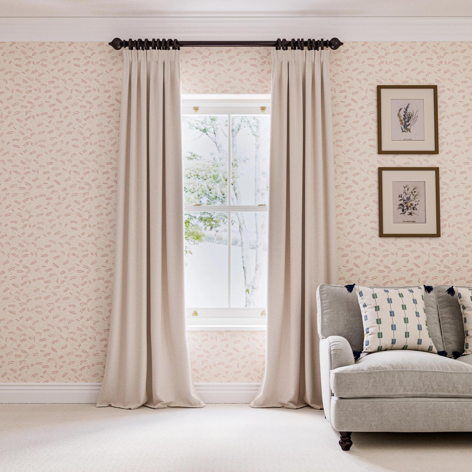
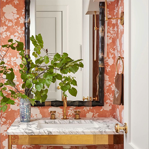
You might want to go for an understated option – one that utilises simple shapes or negative space to avoid turning the wall(s) into the most significant, eye-capturing feature in the room. Our Pasha Sprig Pink Wallpaper is a good example of how effectively negative space can be used – as well as simpler shapes and repetition. When taking in the entire room as a whole, the smaller pattern has a texturising effect, without coming across as overly intricate or busy.
But, as we’ve alluded to, using a bolder print in a minimalist space isn’t an oxymoron. Our Nankeeng wallpaper uses repetition and geometric shapes in a way that minimises negative space – but, even still, without coming across as busy or all-consuming of a space. It creates more of a focal point, but can easily be used in a way that harmonises with, rather than dominates, the rest of the room…
How and where are you going to place it?
The most obvious ways to use wallpaper are as (a) a wall-to-wall covering or (b) as a focal point on a single feature wall. Tried-and-tested, highly effective and evergreen favourites of interior design they may be but, if you’re going for minimalist vibes, not always the most effective.
While these are the most common options, there really are no rules when it comes to wallpaper placement – and, in the past, we’ve gone over some of our favourite unusual and unexpected uses for wallpaper around the home.
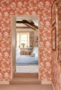
For the minimalist home, making use of the very smallest sections of wall – the recession around a doorway (often amounting to less than a foot in depth), or the thin strips of wall around a feature window, an area partially obscured by open shelving, or even a clean strip of ceiling – will give you the chance to explore pattern without overexposing the room to it.
Plus, with repetition being an important aspect of minimalism, you might even consider echoing that same wallpaper in various other parts of the house. With smatterings here and there, the effect will be strong but not so overt that you lose grip on the minimalist style.
More from Decoration
