Decoration
Colour and Pattern: How to Zone a Room Using Wallpaper
Colour and Pattern: How to Zone a Room Using Wallpaper
Zoning a room is something we do subconsciously and intentionally. In larger or open-plan rooms, creating separate spaces with our furniture is just a natural way to create comfortable and welcoming ‘zones’ for eating, working, socialising, watching TV, or reading – as in our inspiration guide to creating a booknook.
You can zone a room with pretty much any design element or feature – not just the furniture. A rug, for instance, goes a long way to creating a zone within a much larger space – and generally dictates how the furniture should be arranged too – while effective lighting can also be a convenient zoning tool, particularly for creating cosier corners within bigger rooms.
Wallpaper – either used on its own, or as part of a broader ‘zoning operation’ – is another great way to split a room into parts and stop it feeling like one big space.
Here’s what you need to know.
First, what are you zoning off?
There are lots of different zones worth making, and some are much bigger (and more obvious) than others. If you have a large, open plan kitchen dining room, then the most obvious thing to do would be to ‘zone off’ the dining area and try to create some sense of difference between the two areas, in place of an actual wall. Wallpaper is the most effective way to create that division, along with a change in flooring (or, again, a rug).
If, on the other hand, you’re looking to create a very small, separate area within your living room for a writing table or bureau, then using wallpaper to ‘section off’ that small area is not the most obvious option, but it’s just as effective.
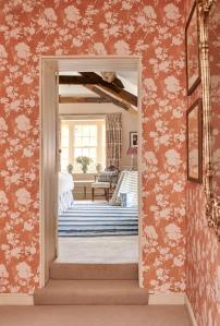
Alternatively, using wallpaper (or a contrasting paint) to section-off higher traffic parts of the room can be incredibly useful. For instance, if the room is fed into by a staircase, then creating contrast between that area and the rest of the walls is great for establishing a sense of distance, and avoiding a space reserved for relaxing feeling like a part of the main thoroughfare.
Next, how ‘strict’ do you want the zone to be?
While that might sound odd, it’s certainly worth thinking about. A subtler wallpaper will generally create much less of a ‘harsh’ distinction between one part of the room and another, while something that stands out more will have the opposite effect.
Of course, what is considered ‘subtle’ in one room will stand out in another. Generally, if you want this separate part of the room to be separated from the rest by only a small distinction, go for a wallpaper with a similar level of brightness (and a similar colour) to the rest of the room’s paper or paint.
If you want it to stand out more, then go for the opposite. While it’s certainly true that, in either instance, the division between one part of the room and another is only theoretical, that’s not to say that the type of paper you choose won’t play a part in determining how significant that division is.
For more information, take a look at our top seven tips for choosing the right wallpaper pattern.
How far are you willing to take it?
This question should be taken quite literally. The most obvious way to zone one part of the room off from the rest using wallpaper is, of course, to paper the surrounding wall, but you can take it one step further than that.
By papering the walls surrounding that area as well as the ceiling above, you can create even more of a ‘surround’ for the area. It will create a greater sense of difference not just in colour and general vibe, but also brightness and hue. It can be a great excuse to add in a little extra decorative lighting – which, as we mentioned, is another great tool for zoning off a particular area within a larger room.
Whether you’re trying to establish a separate dining area within a larger kitchen, a small space for working and studying within the family living room, or a quiet corner within the playroom or bedroom, using wallpaper to create a sense of separation from the rest of the room is incredibly effective, particularly if you pair it with some well-chosen lighting, furniture, and, for even more demarcation, a rug, too.
You don’t need to make it feel as though it’s cut-off entirely from the rest of the room. Remember, one of the great things about zoning is the fact that you can still feel connected with the household, while still having your own space to do something at your own pace – and that’s something we can all benefit from.
More from Decoration
