Decoration
Maximalist Inspiration: Expressing Your Passion for Colour and Print with Wallpaper
Maximalist Inspiration: Expressing Your Passion for Colour and Print with Wallpaper
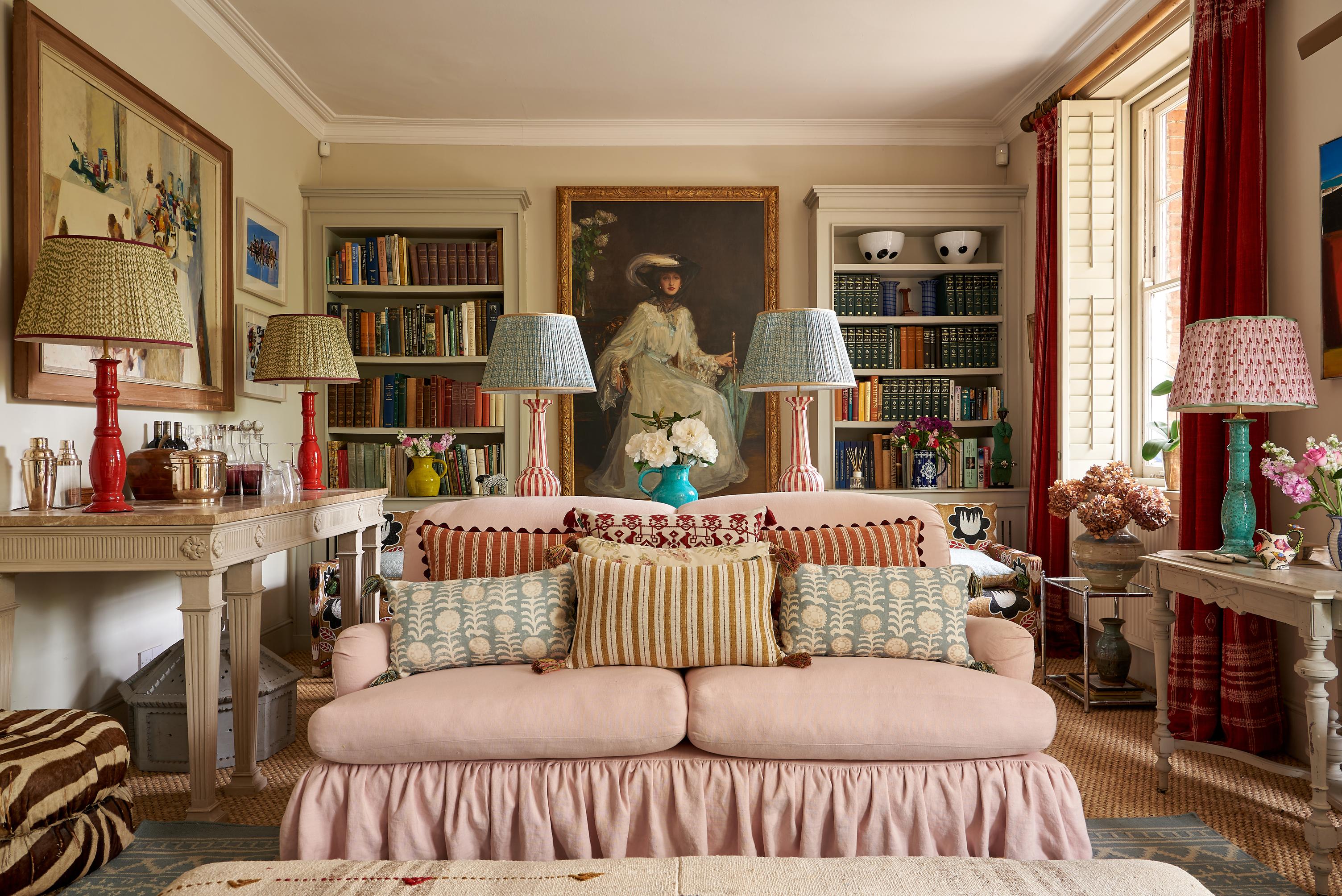
As the name suggests, maximalism is the antithesis of minimalism. It’s a rejection of all things simple, streamlined, and coordinated – and, ultimately, the perfect excuse to explore a passionate love of pattern and colour to the very limit.
For that reason, you can consider us devotees. What’s not to love about an interior design aesthetic that goes against the grain, and lets you explore every element of your personality?
There are plenty of ways to invoke a maximalist feel in your home, but one of the most effective is through the walls…
Remember that maximalism doesn’t necessitate big everything…
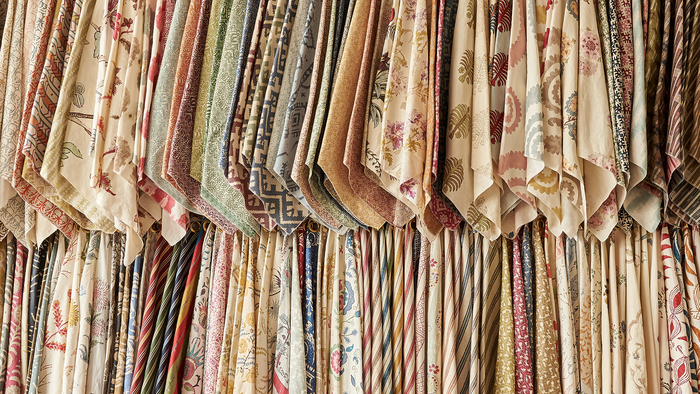
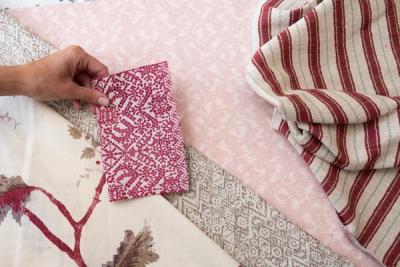
One bigger print makes for a strong design choice, while multiple bigger prints is the key to making a strong design statement. For maximalism to really work, however, you’re going to want to intersperse those bigger patterns with a little more variety – some smaller patterns, and some very small patterns, that fill in the inevitable gaps between one statement print and the next.
Maximalist décor isn’t at its most effective when everything is supersize. Maximalism is all about excess – filling a space with as much colour, pattern, art, and life as possible. And, if you’ve read any of our other guides in the past, mixing wallpaper prints is a job best done with plenty of variety in size and colour.
Long story short, don’t confuse maximalism with a ‘go big or go home’ philosophy. A big pattern on the wall or furniture will look a lot more stylish alongside a selection of carefully chosen smaller patterns, or even some blocks of plain colour.
…Or big anything
You can also easily pull off a maximalist aesthetic without filtering down your list of choices to include only the biggest patterns and prints. While creating that mix of big and small is the most effective (since it stops everything from blending together, and allows some features to stand out more, and others less), that’s not to say that the wall needs to play host to the big patterns.
Yes, the wall may be the obvious choice. In all likelihood, your walls are the largest solid feature in your room (aside from the floors) so it’s understandable why it would be tempting to make use of that space and avoid smaller prints.
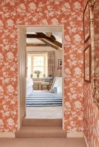
Then again, maximalism is about creating a busy, artfully hectic scene. Decorating the walls with a pattern than repeats over and over again is great for finding that creative excess maximalists crave. And, since it stands to reason that the smaller a pattern is, the more repeats you will get from it, there is a big benefit to opting for a smaller print instead.
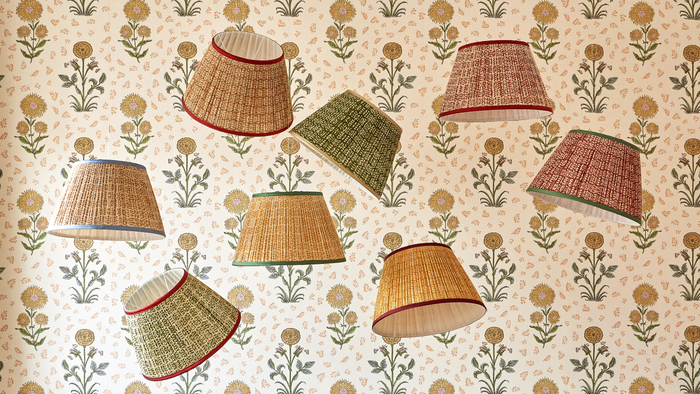
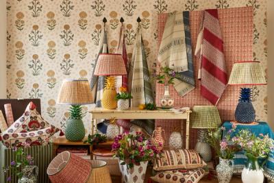
Our Ashok wallpaper has a relatively low pattern repeat, which will make it easier for you to achieve that busy, maximalist look.
Don’t neglect your ceiling either. Maximalism dictates that visitors and enthusiasts will take in each corner of your room: the ones that appear when the floor meets the wall and those where the wall meets the ceiling – top to bottom. Extending a print overhead or finding a contrasting one to create a boundary offer you opportunities to leave no space minimal.
Explore your larger patterns through your furnishings and accents. Just because the canvas is smaller, doesn’t mean you’ll lose any impact. So long as the print has a chance to ‘get going’, it will represent a great addition to the room.
‘Echo’ your print in more than one area
Let’s say you’re eager to create a feature wall using your wallpaper – a great idea, and perfect for ensuring that the eye is always drawn first to a very specific point. But, if you’re pursuing a maximalist vibe, then you’ll want to invest a little extra attention into the rest of the room. You won’t lose the effect of the feature wall, but you will maximise the rest of the space to avoid things feeling too organised and visually streamlined.
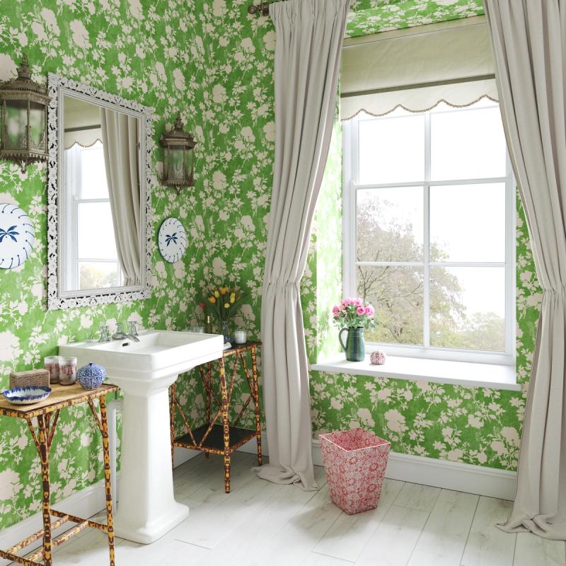
A great workaround is to incorporate your wallpaper into another, smaller part of the room. Say, just within the window recess, or inside the hearth. You even frame small, leftover pieces and hang them on the opposite wall.
If you want a more layered effect, then use the same pattern in another colour. For instance, wallpapering your feature wall with our Magda Pink Green wallpaper is a great way to make a strong statement, but finding a way to incorporate that Dahlia pattern in blue or yellow will make the room that bit more dynamic and exciting.
More from Decoration
