


Decoration
Art in Interior Design: How Much is Too Much?
Decorating with art that inspires is the perfect way to make your home feel more unique and personal to its inhabitants. Click here for our tips.
Art in Interior Design: How Much is Too Much?
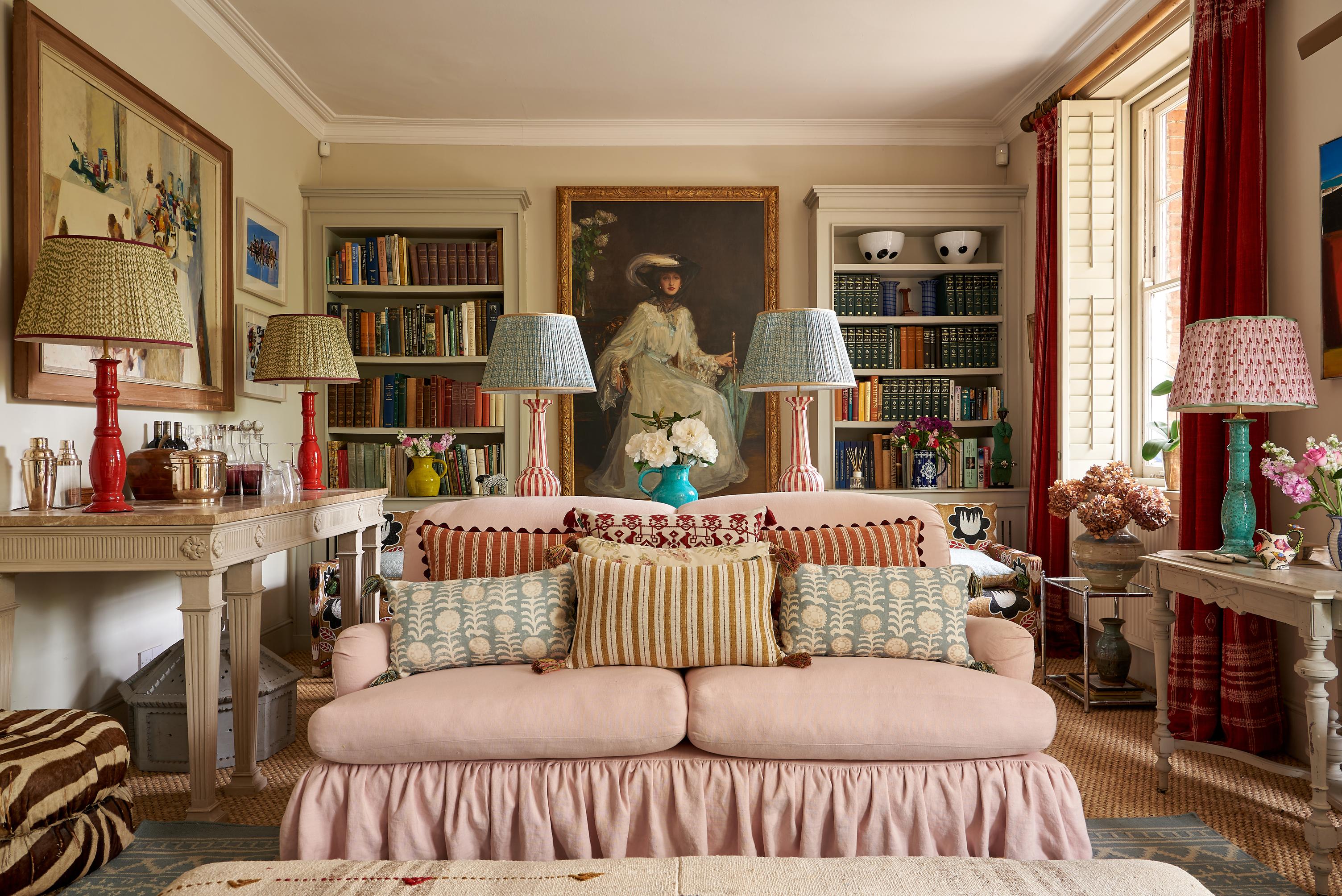
Pablo Picasso once wrote that art is capable of washing the dust from the soul, and those words rarely ring truer than when we stumble upon the perfect piece for one of our spaces. No matter the style or movement behind the work – whether we opt for realism or abstraction, romanticised colours or brutalist monochrome – that feeling of rightness settles as soon as the piece arrives in its new home.
Over the years, we gradually curate our own little (or large) collections, creating space for those pieces we just couldn’t leave behind – a museum of our own arrested attention.
But is there such a thing as too much art? Can the walls become overburdened and begin to resemble the Tate or Louvre? Can a gallery wall consume too much free space? Here are the (general) rules, and when to break them.
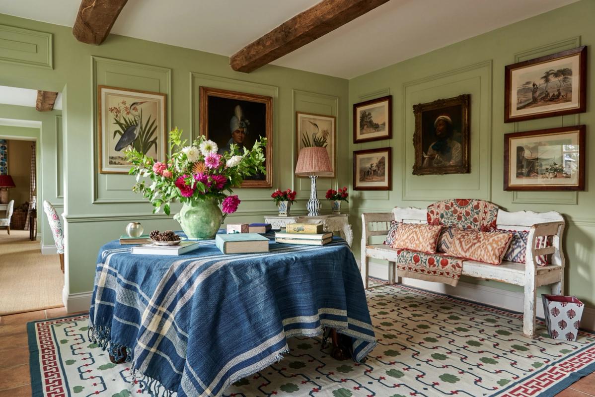
The 60% Rule
This one is simple, quantitative, and generally effective: leave 40% of the wall bare, and cover the other 60% in artwork. A strict 50/50 split would look a little too engineered and intentional. Any less than 60% coverage, however, and those pieces could start to look a little lost.
Of course, that 60% could be covered with any number of pieces. It may be one or two large pieces, or a gallery wall comprising 51 (but not 50 or 52!) different prints, photographs, and original pieces.
When to break it: overabundance always has its place, as does a more minimal approach, but avoid extremes. A single piece can look very lost on a gaping expanse of wall, just as a painting the size of La Belle Dame Sans Merci would struggle on the average chimney breast.
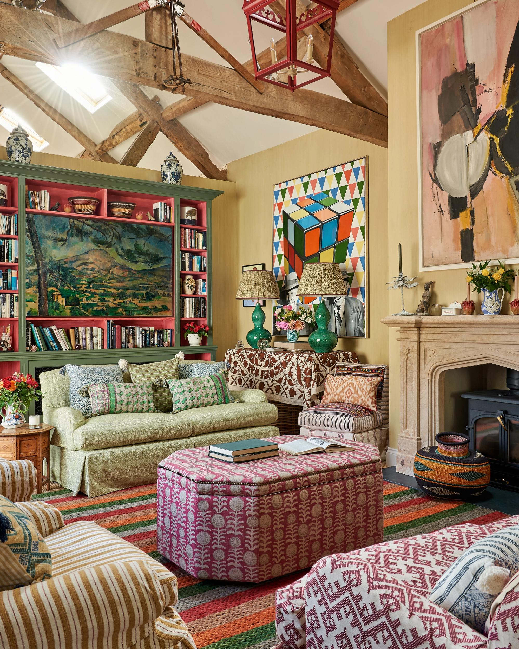
The Rule of Layers
At times, it’s not about the number of pieces in a room – it’s about how convincingly they have been integrated into the rest of the decor. Art is designed to stand out, but ineffective layering can make it stand out for the wrong reasons.
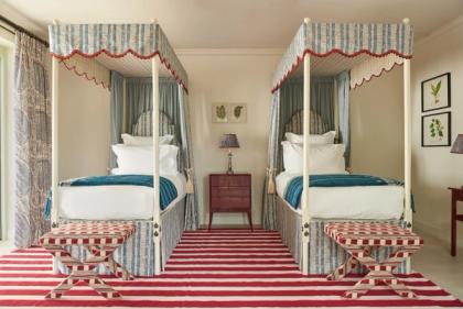
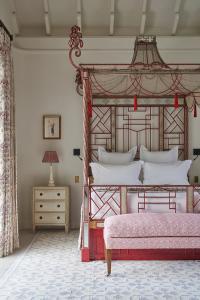
Layering the room over an art piece isn’t as complex or convoluted as it sounds. It can be as simple as allowing a houseplant to fall slightly in front of it, positioning your decorative lighting so that it hits the artwork at a flattering angle, or allowing a piece of furniture to cover just a fraction of the canvas. It’s merely a case of connecting your artwork with the rest of the room’s elements in some way. If the focus feels too concentrated on the art, the room can begin to feel like an art gallery.
There is another rule of layering to consider when it comes to artwork. Most experts agree that layering mediums is the best way to make a room feel natural rather than staged. Oil paintings pair with loose sketches, watercolour with realism, and florals with brutalism.
When to break it: hallways and other more liminal spaces can be the best places to really showcase your art and let it take an unfettered centre stage. In rooms with specific purposes, layering is a much better approach.
The Eyeline Rule
This is another effective ‘rule of thumb’ to consider if you’re starting to wonder whether a space is about to be overburdened by artwork. Instead of looking for blank spaces, narrow your scope to blank spaces at eye level.
Artwork positioned too high or too low looks strange and out of place, and it’s something you will rarely find in any but the most well-supplied of galleries. While it may seem like an obvious piece of advice, keeping it in mind means that you will stop considering the wall (and its potential to house artwork) as a whole.
If you combine the eyeline rule with the 60% rule, then you’ll steer happily clear of overdoing things.
When to break it: Gallery walls rarely stick to the eyeline rule, but for it to work there has to be quite a level of commitment – a sort of ‘no half measures’ approach to decorating a wall space. This Elle guide to creating a gallery wall is the best we’ve found and isn’t afraid to push readers beyond the standard approach to matching sizes and frames.
The Pattern Rule
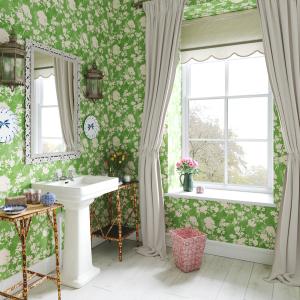
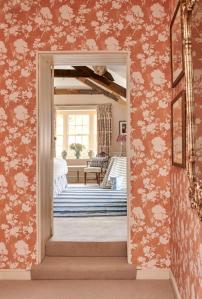
If you’re working with a papered wall, then figuring out how to position artwork around that print can be tricky. An excess of colour or pattern can easily cause a wall to feel over-decorated, but this usually only occurs when you’re working with the wrong-sized print.
Larger prints are often mistakenly seen to be the perfect pairing for a busier wall since they tend to feature more negative space. The trouble is, if the pattern has a wider repeat, then there’s a very good chance that it will struggle to ‘complete itself’ in between the pieces hung on the wall.
Smaller prints repeat more often – obviously! When they are paired with a wall of artwork, they don’t tend to suffer quite so much from the pieces jostling for space in front of them. You can take a look at our guide to finding the right sized pattern for your wall if you want a little more guidance.
When to break it: Maximalists the world over have been successfully breaking this rule since it was first created. An overburdened wall only needs to feel overburdened when it is not sufficiently balanced out by the rest of the room. If you want to throw everything – colour, print, gilded frames, small and large, canvas and tapestry – at a wall that is already made beautiful by a wallpaper, then look to the rest of the room to contextualise the maximalist vibes.
More from Decoration