Decoration
Why The Wes Anderson Aesthetic is a Match Made in Heaven for Interior Design
The Wes Anderson aesthetic has risen once again to the height of popularity, particularly among interior designers. Click here to find out more.
Why the Wes Anderson Aesthetic is a Match Made in Heaven for Interior Design
As all good things tend to do, the unique aesthetic of the American filmmaker Wes Anderson is experiencing a wave of popularity online. The pastel hues, quirky mismatch of design and architectural movements, suave editing, smooth muzak and statically polished staging that have come to represent Anderson’s impact on cinema are finding fresh favour with artists and creators the world over.
It should come as no surprise, really. Few filmmakers are able to establish a more immersive world – familiar yet foreign, calmingly surreal, saccharine but masterfully realised – with such (apparent) ease. These productions capture our attention, not least of all because they straddle the line between reality and fantasy, with just enough balance that we can get away with mirroring them in real life.
Colour stories
The term ‘colour story’ is often used interchangeably with ‘colour palette’ – and, in many ways, they are one and the same. On paper, ‘colour story’ comes across as a little more polished and intentional than ‘palette’ but, really, what’s the concrete difference?
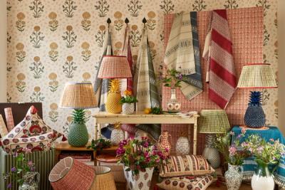
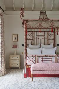
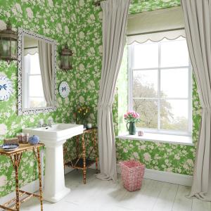
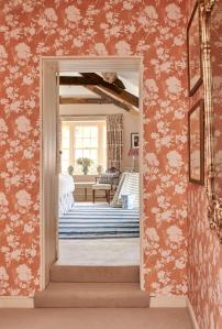
A look into the world of Wes Anderson inspired interior design is about the most compelling answer you could hope to find. Described by architect Michael Chen, MKCA founder and creative force behind this New York townhouse, as ‘a gleeful embrace of color’, the key is saturation (lots of it) rather than nominal ‘pops’ of colour.
These colours are explored in a way that feels guileless, even though, deep down, it’s masterful. Embracing often-maligned colours like primary yellow and saturated pink – which can, as it happens, be used very effectively in interior design – without any attempt at ‘tempering’ those hues with a more neutral base or accent.
Symmetrical lighting
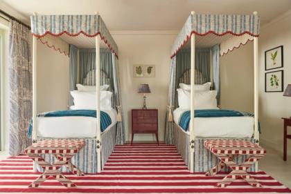
Symmetry is perhaps the biggest reason why Anderson’s static shots are so impactful. Scenes do look stiff and posed, but this is carried off with a seductive charm thanks to the attention to detail when it comes to balancing one element or person against another.
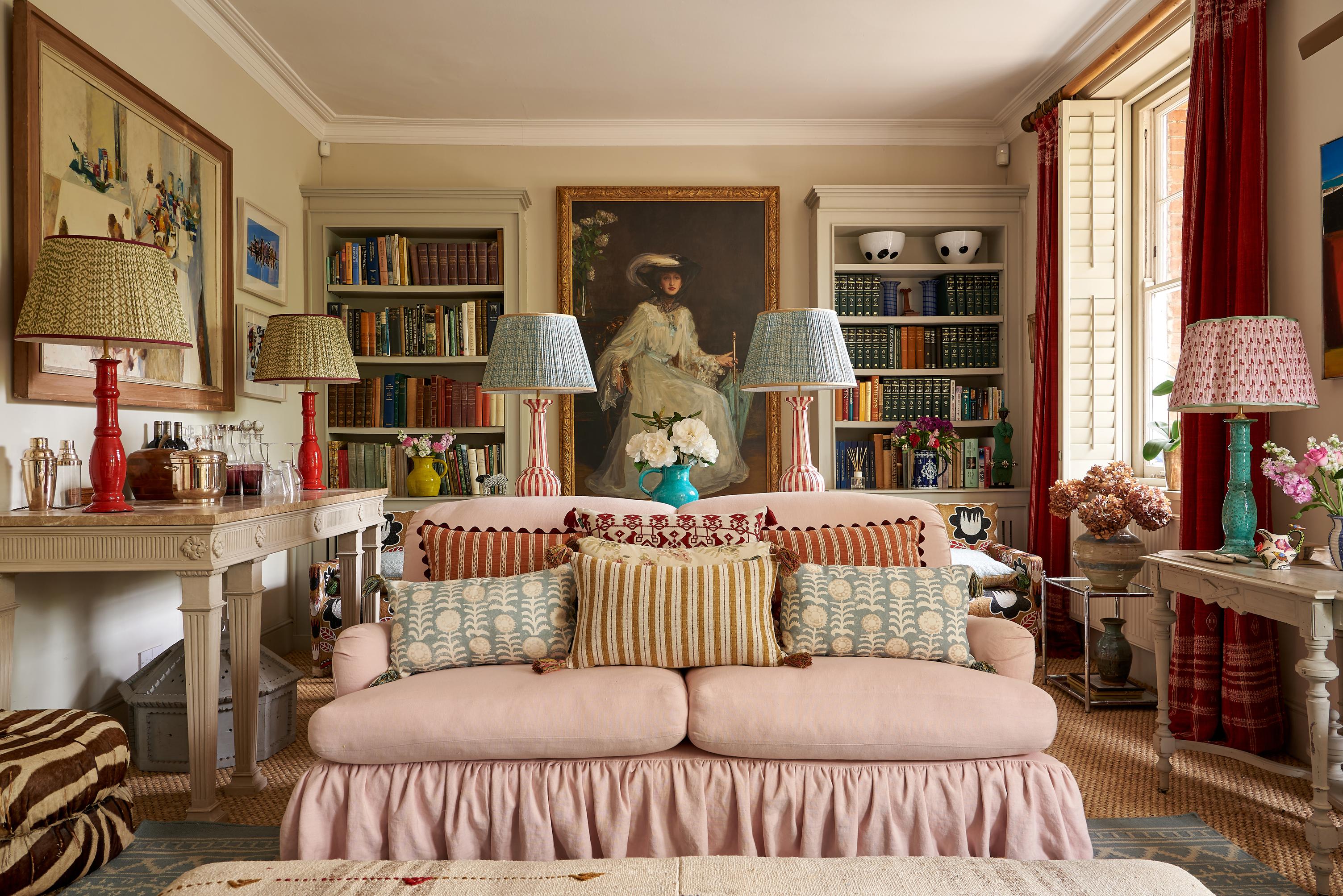
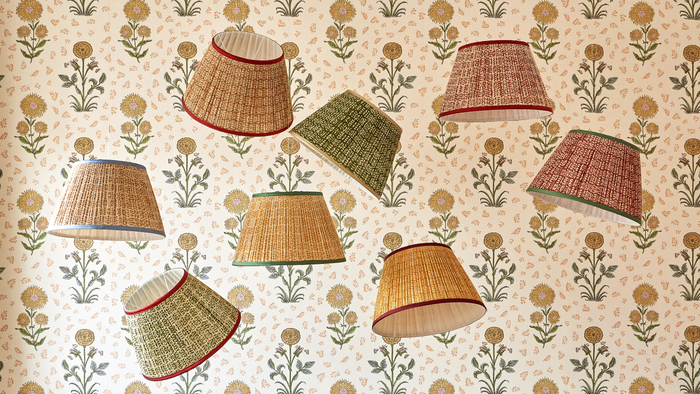
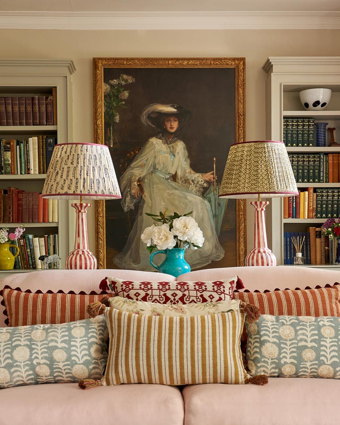
The most effective example of this can be found in lighting, and the way Anderson uses it to balance a scene. While some spaces are brightly lit, many more are illuminated by decorative lighting symmetrically positioned on either side of the room, or a key piece of furniture.
Layering lighting is one of the best ways to bring atmosphere into a space – and, while popular advice says to intersperse your decorative lighting to keep the room from being too balanced, there is something to be said for doing the complete opposite.
Beautiful eclecticism
Wes Anderson’s works tend to exist out of time and place. Sets are peppered with curios from various points in history, so much so that characters seem to float between the very modern and the very old-fashioned.
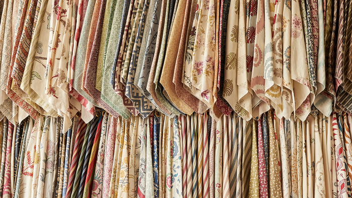
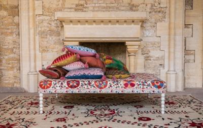
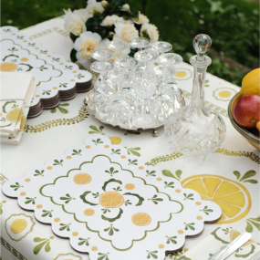
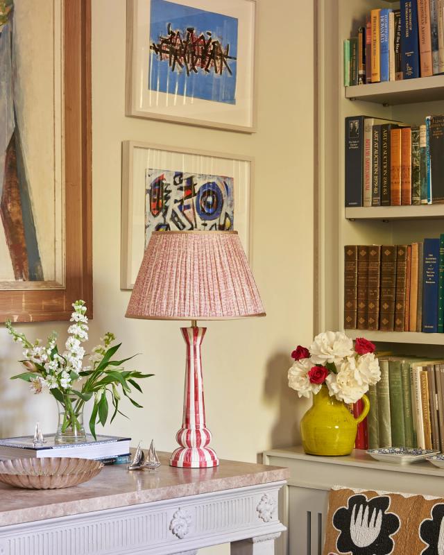
The Anderson aesthetic gives the interior designer carte blanche to decorate the home with a variety of interesting objects, from collections of hand-painted tableware bearing all the beautiful little quirks of human error to linen cupboards bursting with embroidered, block-printed, and hand-woven textiles. Every object is objet d’art, whether it’s decorative lighting, an assortment of books, or simply the coats hung oh-so intentionally on the coat rack.
High geometry
It would be a mistake to think that the Wes Anderson aesthetic precludes patterns. While these sets tend to be predominantly focused on blocks of saturated colour, the emphasis Anderson’s staging places on geometric architecture and staging lends itself to the artful use of pattern and print in the home.
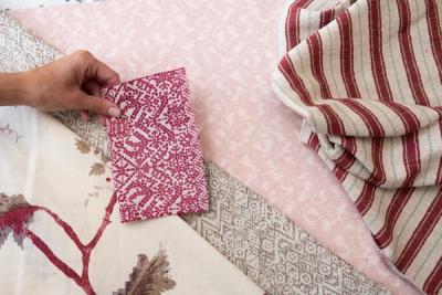
A few key, statement pieces in a bold weave like our Chennai Weave or our Floral Tile, are perfect for harnessing that architectural singularity in smaller spaces within the home.
It’s no surprise that Wes Anderson’s unique and distinctive aesthetic has come back around full force and captured our hearts all over again. It also shouldn’t come as a surprise that this aesthetic has found a particularly compelling outlet in interior design, where the immersivity and otherworldliness of the style can be realised in 3-dimensions.
That’s not to say we all need to wake up tomorrow in our own rendition of the Grand Budapest Hotel, but that, if ever you needed an excuse to feel a little freer with the colour palette (and a little less chained to the rules), the Anderson Aesthetic is a very good place to start.
More from Decoration
