


Decoration
The Gallery Wall: Why it's Harder Than it Looks (But So Worth it)
The Gallery Wall: Why it's Harder Than it Looks (But So Worth it)
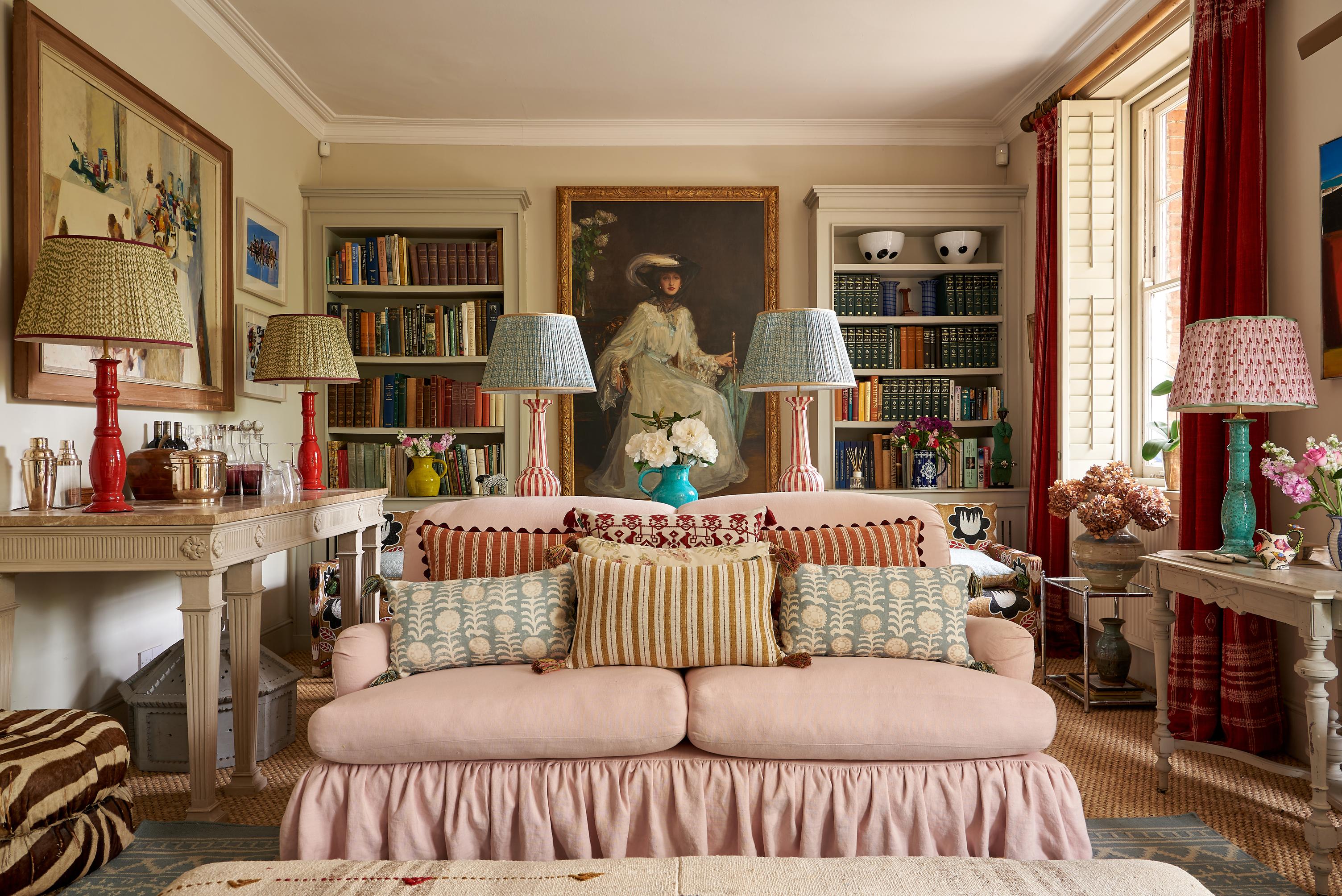
So, you’ve been charmed by the gallery wall. Welcome to the club – it’s millions of members strong (at least), and all we do is sit and stare at underutilised walls that might just be perfect for a spread of framed photos and artworks. We’re not about that sensible tryptic or ‘double frame’ rule; we’re either going to cover 90% of the space available to us, or we’re not doing it.
In all seriousness, the gallery wall is a particularly striking feature for the home. It’s a beautiful, eye-capturing jumble of special moments and things we can’t resist giving pride of place. It’s the sort of thing guests are drawn to – to standing in front of with their hands clasped behind their backs, studying the wall like a critic at an art show.
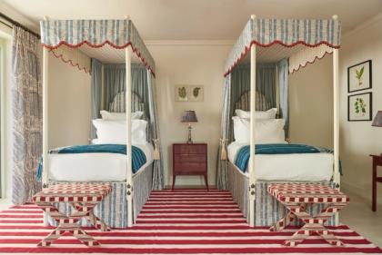
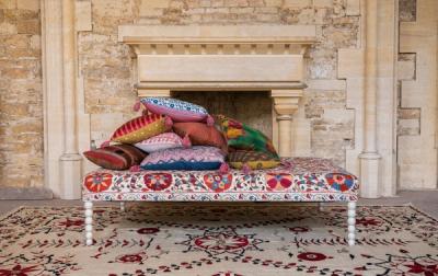
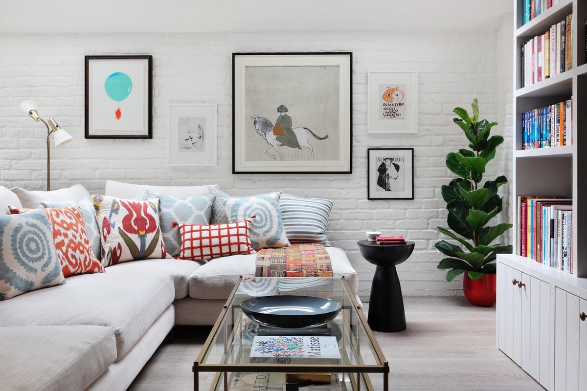
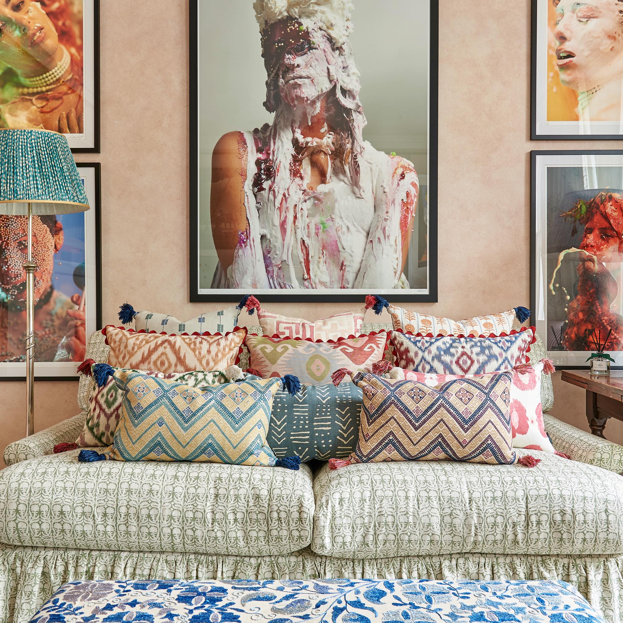
There’s no ‘one way’ to do it, either. While some people opt for a very orderly, regimented layout – a little like an American city divided into even ‘blocks’ – others opt for that appearance of haphazardness and spontaneity. While some people go for a theme comprising nothing but black and white photography, others go for an unsystematic assortment of family portraits, candid photos, children’s artwork – even curious keepsakes like framed Post-Its, framed receipts, and those too-good-to-recycle Pictionary doodles.
Why are Gallery Walls Hard to Pull Off?
The gallery wall is a timeless favourite for interior design, but it’s rarely as easy to pull off as it looks. If they’re not strategically chosen, your prints/artworks can actually ‘cancel one another out’, creating a wall with no specific focal point.
There are, of course, ways to ensure that the eye travels over the gallery wall the right way. Here’s what works for us…
Pulling off the black and white gallery
Black and white photography looks excellent. It emphasises contrast, light and shadow, and it looks incredible all together. But, if you want to make the wall feel ‘finished’, we’d recommend a vibrant abstract or geometric wallpaper. This will echo the high contrast of the photos, but also bring the benefit of colour and a repeating pattern. The wallpaper will draw the eye initially, but those prints will be what it lands on.
If wallpaper isn’t an option, we like to inject some colour through the curtains. A gallery wall sandwiched between two windows is ideal, because both sets of curtains will act as a frame to the wall in between. A bright statement pattern will really liven up the wall, and encourage the eye toward the gallery more than it did before.
Pulling off the ‘anything and everything’ gallery
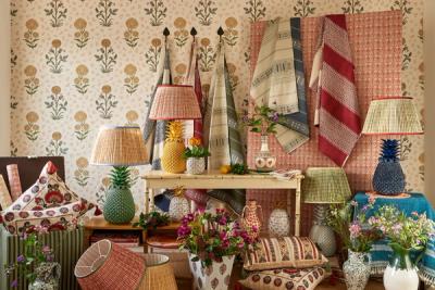
It seems easy enough for the B&W crew, but what do you do when your wall is more of a ‘hodgepodge’ (in the best sense of the word) of colour, pattern, photography, and artwork? A bright, cheerful wallpaper could still look great, but better suited to a very maximalist style of décor. If you want to keep things as cohesive as possible, and give the wall a good flow, then you have a few options.
It can also help to integrate the wall with the rest of the room’s décor. By that, we mean interspersing frames with furniture – building the gallery around, say, a chair or a side table so that everything feels organic. Imagine the way, in a forest, roots and trunks and leaves will grow around obstructions, and the unique shapes and silhouettes that creates.
As you can imagine, this is very effective for walls that are supposed to look jumbled – as though, over the years, the family has continued to add more and more wherever they found the space. It’s a great look to achieve, and means that there is always room for that extra little photo, postcard, or memento to take pride of place.
More from Decoration