


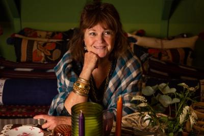
Decoration
The Effects of Colour Drenching
Colour drenching is a bold move to make, but the rewards can be high – provided you’re not afraid to break a few rules in the process. Click here for more.

The Effects of Colour Drenching
Colour is a powerful tool. It can impact mood, play with proportion and scale, draw the eye or evade direct attention almost completely – and it’s something we all have an opinion on.
There are so many ways to use colour like any other creative tool, and one of the most extreme is colour drenching – an arresting technique for a full-page magazine spread, but what about in the home?
What is Colour Drenching?
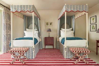
Colour drenching is the technique of flooding an entire space with one colour. It’s also referred to as monochromatic design which, while typically used to refer to spaces decorated with shades of grey, can refer to any colour at all.
Colour drenching is likely seeing a particular amount of interest right now thanks to the release of the Barbie film, which imbues each frame with varying shades of pink from candyfloss to cerise. Plenty of films adopt the technique through lighting and filters, though few take it to such extremes.
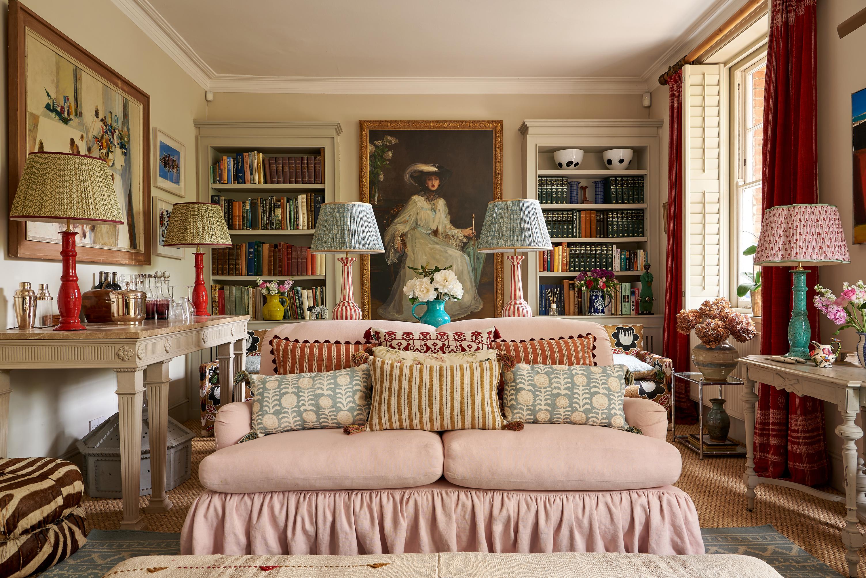
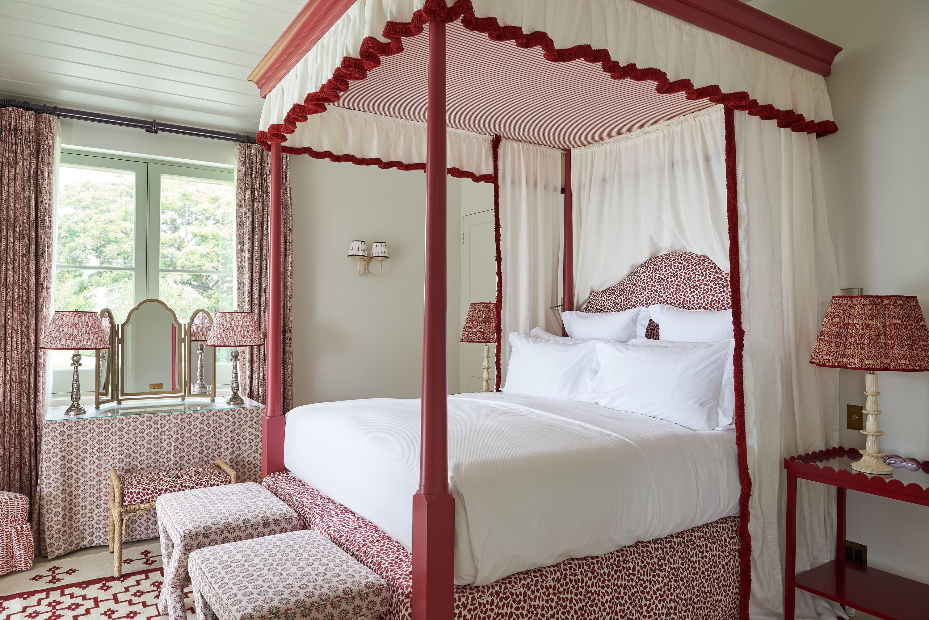
In the home, colour drenching can be an excellent way to make a statement. It’s a technique that is certainly not for everyone, but it’s also surprisingly versatile, working for both minimalist and maximalist interiors. You can even rope in your lighting to make the scene feel more cinematic by experimenting with coloured bulbs, and using thinner fabrics – a light linen, for instance – as curtains that allow some filtered light to pour in.
As a result, colour-drenched rooms can often appear as though someone has placed a lighting gel over the scene, and the effect really is as theatrical as it sounds. It’s certainly not for everyone, but neither are any of the very boldest interior design techniques.
Using a variety of shades is the key to avoiding an overly flat, cartoonish look. Then again, unless you’re a stickler for the rules, colour drenching can be an excellent opportunity to make the most of negative space – the patches of white or black between different elements. These colourless spaces can create a stronger sense of depth and variances – a less stylized interpretation of the colour-drenching technique.
How Colour Drenching Changes a Space
It all depends on what you’re willing to take to extremes…
Immersive drama
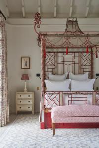
Painting and decorating an entire room with a dark, murky green or midnight blue may seem like interior designing against the tides – after all, who hasn’t been warned against painting the ceiling in a dark shade, or layering dark on dark, les the entire room shrink down to half its original size?
It’s true that dark colours can be a challenge – unless you’re willing to embrace the supposed ‘downsides’ to decorating with dark colours.
Taken to extremes, dark colours can produce some of the most stylised and cinematic spaces imaginable.
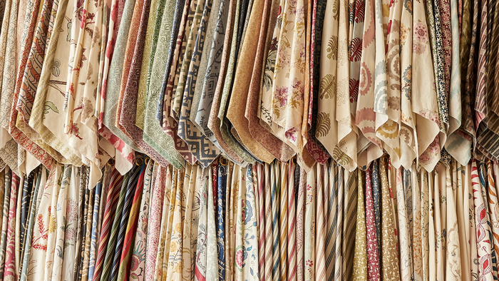
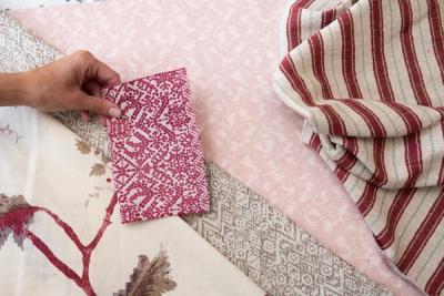
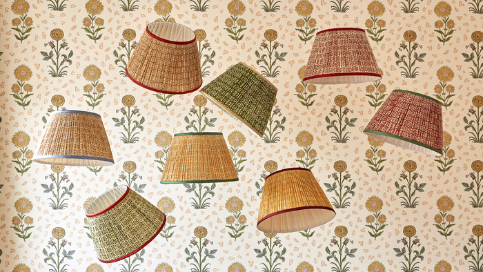
Avoid the room feeling flat by introducing some variance in shade – and a little negative space. It needn’t be a feature wall of stark white. Consider upholstering the main piece of furniture with a delicate abstract like our Tulkan Blue fabric or Tulkan Red. This sort of print will inject some much-needed texture into the room, without draining your colour drenching of its impact.
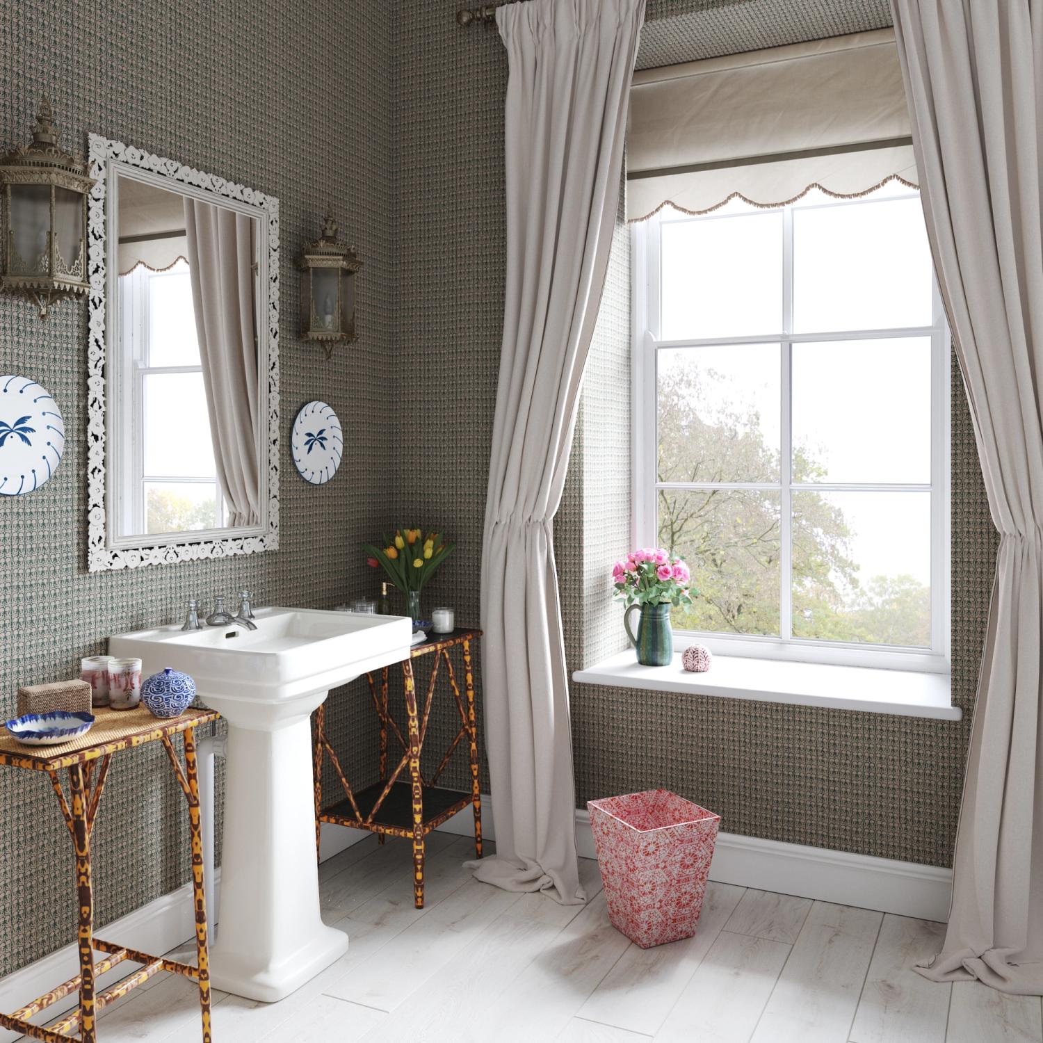
The walls are another great place to focus on adding texture. Again, utilise more delicate, abstract prints that introduce some variance. Our Ashok Petrol on Natural wallpaper will stay ‘on theme’ for any moody blue room, without draining it of its depth.
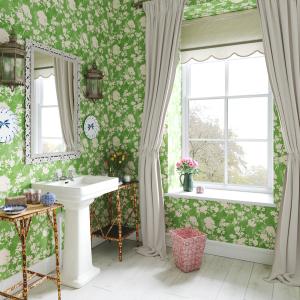
Depthless tranquillity
Dark colours aren’t the only way to make an impact. Pastels are an excellent choice for rooms devoted to less frenetic activities – reading, playing music, art, and study. While darker rooms can afford a little negative space without losing impact, it’s worth keeping in mind that the lighter your colour choices, the more readily the ‘colour drenching’ impact will be lost with the introduction of some negative space.
Even black, at the opposite end of the colour spectrum, will need to be used sparingly – or, ideally, not at all.
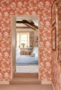
But an entire room draped in shades of light green, from airy spearmint to fresh spring foliage, or delicate pinks from baby to azalea, or sky blue to ultramarine, can be just as impactful on the mood and atmosphere as a room cloaked in the darkest, boldest shades.
Choose upholstery fabrics that aren’t trying to be the same shade. The closer they are in tone, the less organic things will look. Make sure the room is evenly scattered with differing shades, and use decorative lighting to uplift the darker corners.
Desaturated colours tend to be relaxing, with some of the most relaxing colours falling at the lighter end of the spectrum. Red is generally ruled out of tranquil spaces, but that’s not to say a desaturated red combined with richer pinks can’t promote inner peace in the right context.
More from Decoration