Decoration
How to Mix Wallpaper Prints – and Get Away with it
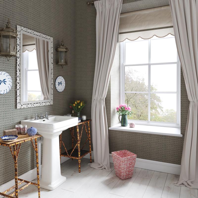
How to Mix Wallpaper Prints – and Get Away with it
For most people, a very definitive rule of one wallpaper per room is enough. For some people – AKA, the minimalists – it’s more than enough, since the most understated, lowkey and minimalistic style of wallpaper is ‘no wallpaper at all’.
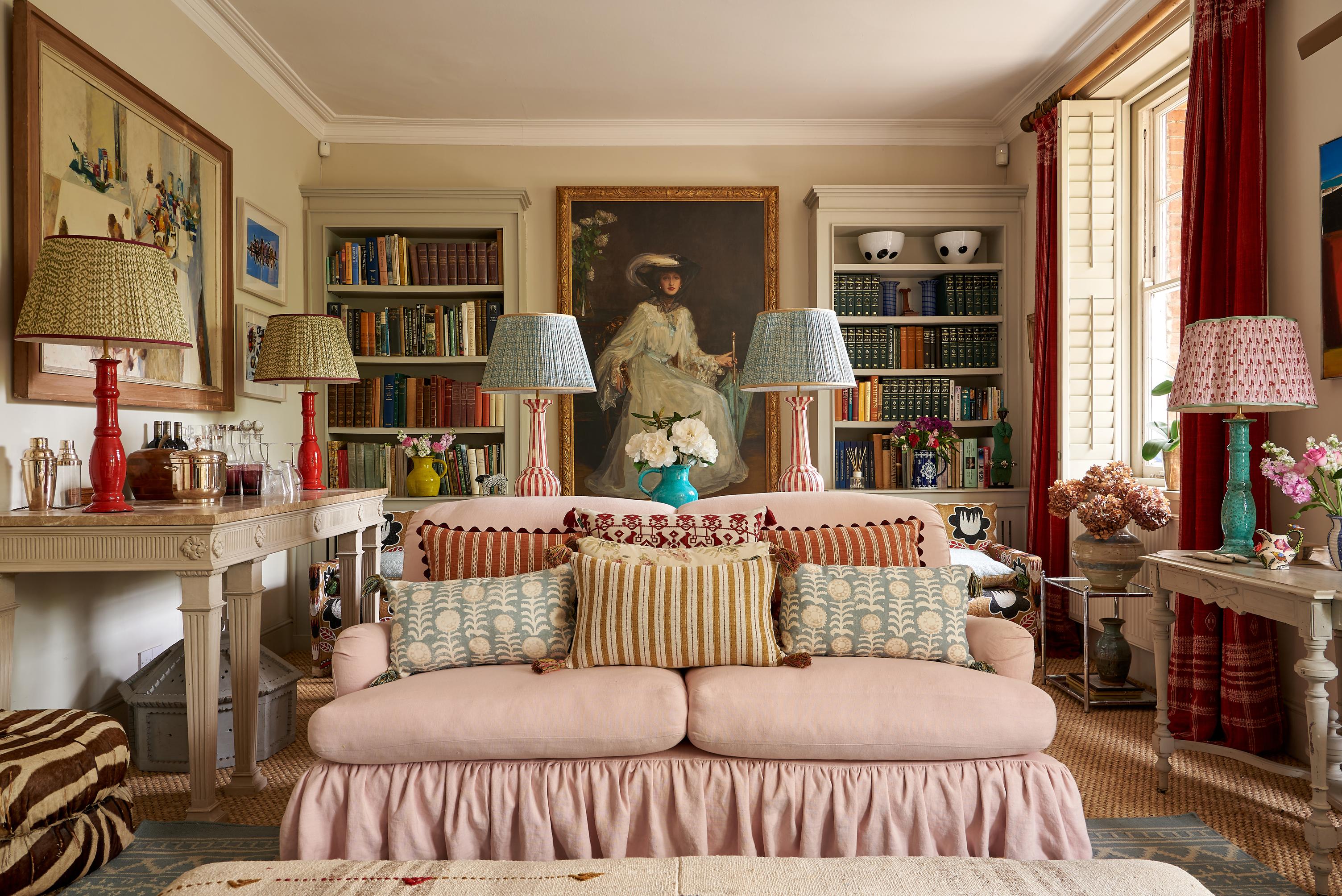
But, for the maximalists – or, really, just anyone who has a strong love for print, depth, texture and layers – concentrating all that love into one wallpaper is more of a challenge and leaves many wondering if they could really get away with breaking one of the cardinal rules of interior design.
So, can you really use more than one wallpaper in a single room?
How much ‘ground’ are you willing to cover?
This is, of course, key, since introducing more than one wallpaper will necessitate more available space. If the sum total of your wallpapering needs is represented by the chimney stack, then you’re going to face a lot more of a challenge to incorporate two or more prints into the walls than you will if you’re happy to paper the chimney stack as well as the walls, and the ceiling.
It's not impossible to mix-and-match wallpapers with limited space. Some interior designers have created some incredible results by pasting a small amount of wallpaper within the hearth, and there’s no reason why you can’t combine that with a contrasting paper on the chimney stack. For obvious reasons, this is a design choice best reserved for fireplaces that are no longer in operation. It’s worth taking a look at our guide to using wallpaper in smaller spaces if you’re stuck on ideas.
For anyone with the whole room to spare, keep in mind that intentional and carefully planned placement is always best – even if you’re aiming for the appearance of a bohemian, laissez-faire room. Pattern mixing is a tactical project.
Wallpapered ceilings can be highly effective, whether you use the same wallpaper or a contrasting style. Another way to incorporate a ‘secondary’ paper into the room is to use it in a recessed area. An area of built-in shelving, for instance, where only parts of the wall are visible, can be the ideal ‘canvas’ for a second print – or, alternatively, the recess of a window or doorway.
How coordinated will they be?
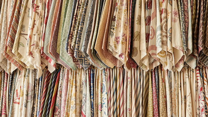
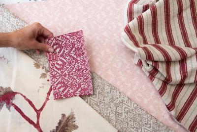
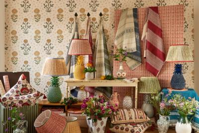
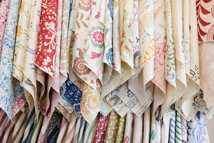
Whether you’re mixing wallpapers of fabrics, this is the ultimate question to ask yourself. There’s a world of difference between using two wallpapers that feature the same print in different colour stories, two prints of a similar style (say, floral), and two prints that represent two very different styles (for instance, a floral and a geometric).
Often, more variation can be easier to ‘play off’ than less. Two floral patterns, for example, run the risk of appearing too busy and too much ‘of a theme’, whereas a feminine floral and a more grounded stripe or geometric shape can seem more balanced, and less overwhelming to the eye.
Remember that, unless you’re looking to go really against the grain, the best way to maintain a sense of cohesion is to avoid competition between your prints. In other words, avoid having two prints of a similar size.
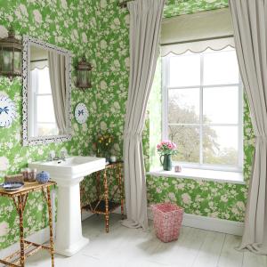
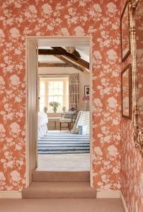
Varying size will create a better sense of depth and dimension, whether you’re pitting one floral against another or introducing a little more variation to your room’s theme. For instance, the smaller, more intricately drawn florals in our Ashok wallpaper contrast strongly with the bolder silhouettes in our Flowerberry wallpaper, but they share just enough similarities in terms of theme and arrangement that they will pair well together in a larger room.
Will you zone?
You can zone a room with anything. You can create a zone with a tactfully arranged rug or furniture, or zone a room with your lighting (or a combination of all three). You can also create zones very effectively using wallpaper and, while the most popular approach is to use one type of wallpaper to mark off one specific area within a larger room, the same can be repeated in numerous different parts of a room (large or small), depending on how much wallpaper you find, and how many different zones you need.
True, you might spend longer agonising over wallpaper samples than the average home decorator, but, if you can pull it off, it will look incredibly unique – and make a larger room feel a lot more inviting. It’s natural for anyone to want to ‘break up’ a larger space, and combining zoning techniques with your lighting, flooring (or rugs) and wallpapering will make the most effective transformation.
The ultimate key is to not be afraid of choosing more than one wallpaper. We often feel like we have to whittle down our list of favourites to just one, and that any more would automatically be ‘excessive’, but that needn’t be the case – and you can prove that yourself.
More from Decoration
