Decoration
Landing Inspiration: Not Just a Flyby Zone
Landing Inspiration: Not Just a Flyby Zone
The landing. Possibly worse than the hallway by the front door, in terms of creative scope. When we first move in, it’s often overlooked in the planning phase in favour of rooms that can, you know, actually need to be planned. There’s a furniture layout to draw-up for the living room, cupboards to allocate for the kitchen, a bed to orient in the bedroom – but where does the landing get us? From point A to point B.
Then again, even if you’re stuck with a space that’s only good for pivoting, there are still plenty of things you can do to turn it into another well-utilised room of the house. True, you may never linger there for a cup of tea or a conversation – it may never be quite the ‘ta-da’ moment the living room and kitchen are – but you can still make it beautiful and, most importantly, make the most of it.
Here are some of our most reliable ideas for the landing, whether yours is strictly ‘pivot room only’ or large enough to accommodate a piece of furniture.
The Small, Pivot-Room-Only Landing
Limited, yes. Impossible? Definitely not. Turning a small space into a feature really doesn’t rely on you being able to squeeze an armchair or a bookshelf in like one too many sardines in a tin. In fact, that’s (obviously) the worst thing you could do, and the space will not only pose a real hazard, but your staircase will look more like it’s been taken out of commission than given some TLC.
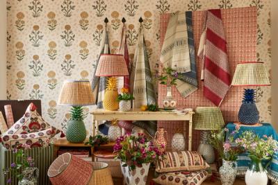
For the very small landing, we would recommend embracing the element that takes up the least amount of space: wallpaper.
Wallpapering the wall at the very top of the stairs, which will, to some extent, be visible from the bottom step, too, you can actually create the illusion of a larger, taller landing space. The print will gradually come into focus as you near the top, and a statement colour that contrasts with the downstairs hallway or landing will help to create that sense of movement from one area to the next.
Some people go so far as to use their wallpaper offcuts to decorate the risers on their stairs. It’s a bolder choice, and won’t work for every house, but it may be what you’re looking for to bring a sense of intentionality into a rather uninspiring part of the house.
The Generously Small Landing
When you’ve got a little room to play with – emphasis on the ‘little’ – but still not enough to really turn the landing into its own space, one of our favourite things to do to is the sideboard. Good for storing those items that tend to make it halfway up the stairs before they’re put down ‘for later’, and ideal for introducing some extra lighting into the space.
Landings are known for representing dark spots in the house, mostly because, when faced with the choice between the glaring, overhead light or the glow from other rooms that open onto the landing, most of us go for the latter.
Some decorative lighting gives versatility. It means you can leave the light on at night for nocturnal inhabitants without blinding anyone on a midnight jaunt to the bathroom.
Combined with a heavy, statement curtain at the window – maybe, if there’s room, long enough to pool on the floor, to make use of that floorspace. Not the best idea if the window is right at the top of the stairs, for obvious reasons!
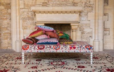
Alternatively, a small chair-come-storage unit, like an ottoman, could be ideal. You’ll be surprised how much use this midway point between downstairs and upstairs gets used.
The ‘We Could Turn This Into Something’ Landing
Now we’re talking. When you’ve got the space to turn your landing into a sort of hybrid of landing and ‘room’, you’ll find so much scope for creativity.
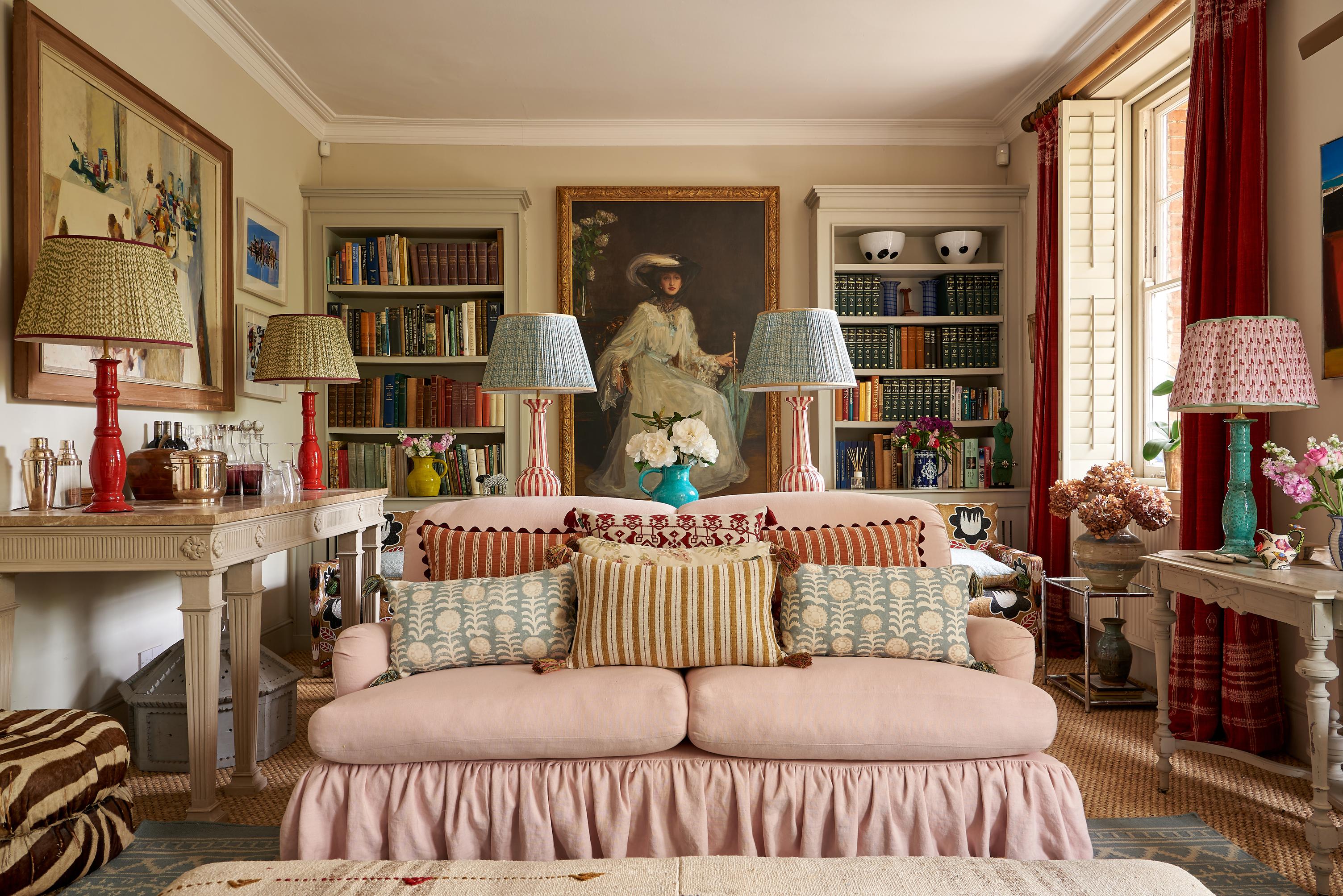
We love a landing with a sofa. They’re lovely resting places in the middle of the house, halfway between the home’s busiest and quietest points. They’re much-loved as quiet spots for reading the bedtime stories since there are fewer distractions than those in the living room.
Plus, away from the main rooms like the kitchen, family room and living room, you can get a little more creative in terms of upholstery fabric. Think about choosing a statement fabric – unless, of course, you’re also integrating a statement wallpaper into the space.
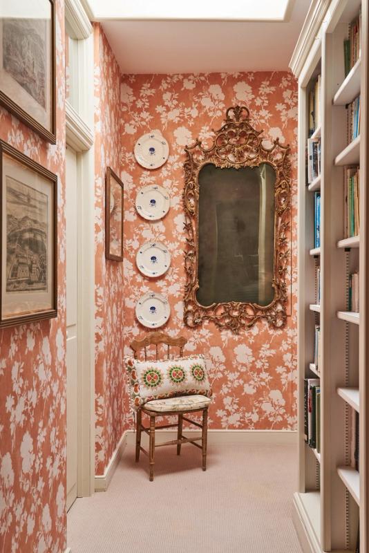
We love the impact of a bright botanical on a space like this. It will create a focal point that draws the eye as you’re walking up the stairs, help to make the space feel brighter and fresher, and make a beautiful, liminal space for relaxing on those slow and quiet weekend mornings.
More from Decoration
