


Decoration
Artwork and Wallpaper – How to Find Harmony
It is not always easy to find a good match between your wallpaper and your framed art and photography, but it’s not impossible. Click here to read more.

Artwork and Wallpaper – How to Find Harmony
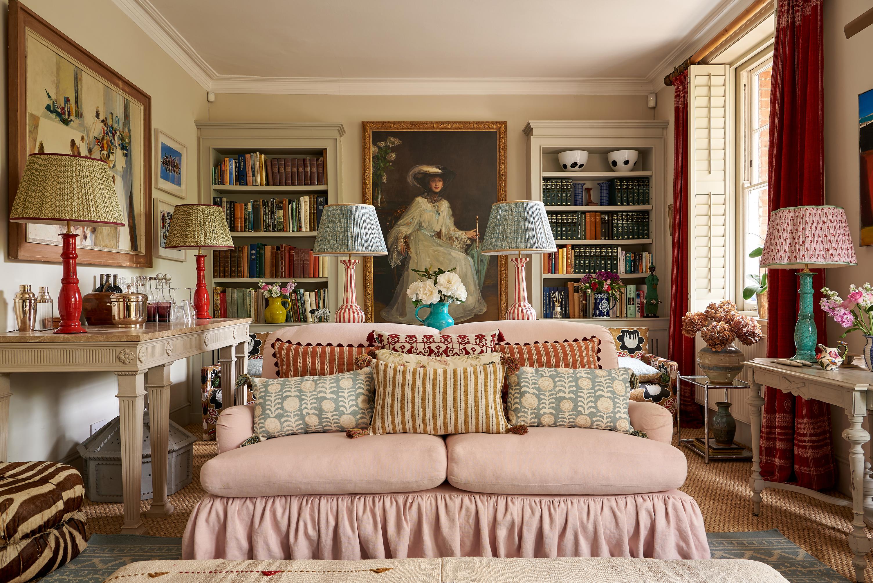
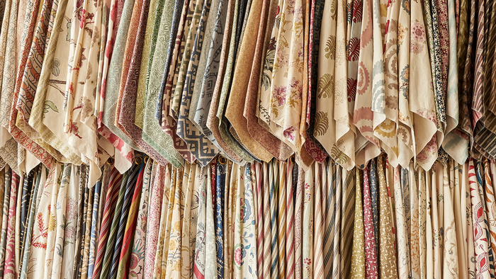
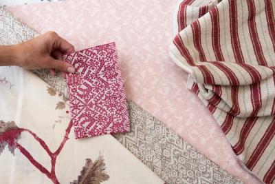
Introducing wallpaper into your home is like taking on a fresh challenge. True, it’s a very worthwhile challenge when the reward is a fresh dose of beauty, vibrancy, and personality in a room that needed a little something more, but it’s a challenge, nonetheless.
Why? Because, all of a sudden, you have a new element to work around – a new pattern to take into consideration when it comes to choosing fabrics, lampshades, rugs, and, of course, framed pictures and paintings for the walls.
It can be tempting to leave the stretch of papered wall to its own devices – to avoid the decision altogether by just leaving it bare. An empty, papered wall can look beautiful, but so can a wall that features the best of both worlds – providing you know how to keep the peace between the two.
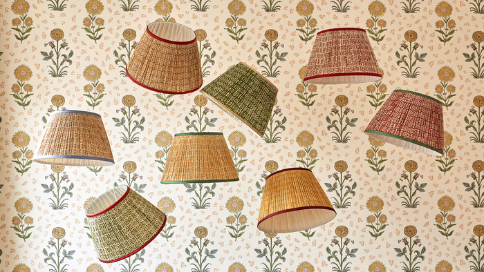
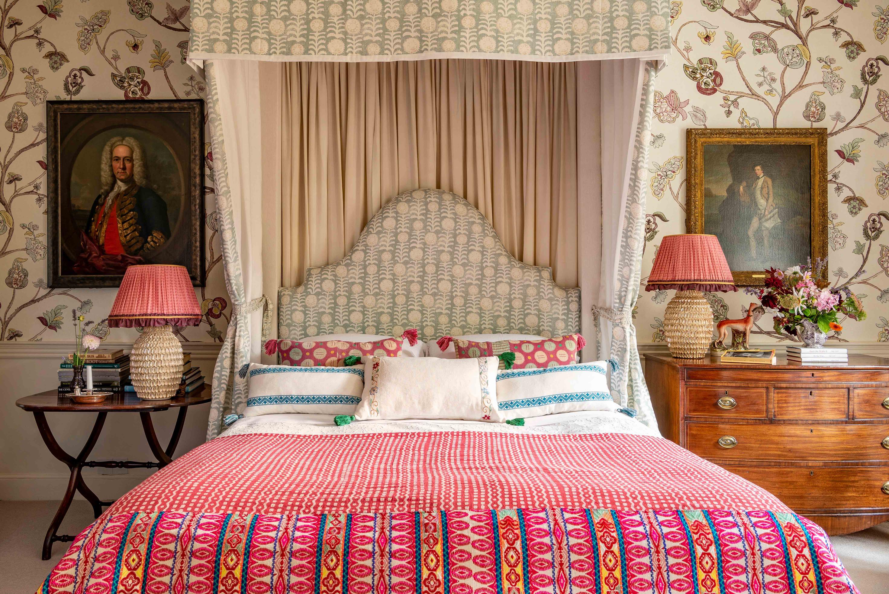
Vary scale
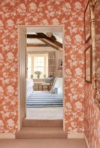
Instead of focusing too hard on coordinating the colours in your wallpaper with the colours in your artworks, focus instead on keeping plenty of variation in scale. If your wallpaper features a small, intricate pattern, then be intentional about contrasting it with larger prints – an enlarged photograph or landscape painting. Alternatively, if your wallpaper is on the bolder side, contrast it with some more delicate accents that draw the eye in, and refocus it on something intricate.
Varying scale is one of the best ways to avoid swamping one element with another. It’s a common technique utilised in interior design, whether it comes to arranging the larger furnishings, the soft touches like pillows, or the smallest embellishments.
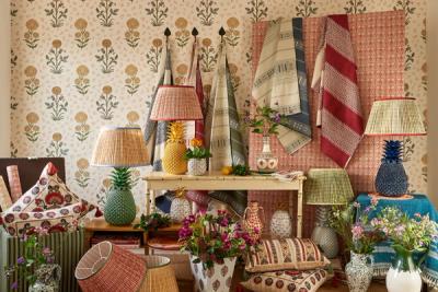
Embrace maximalism
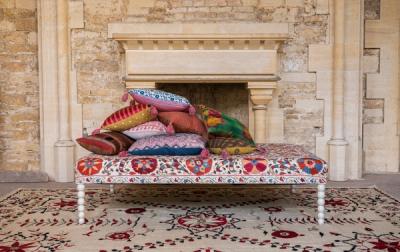
More is (sometimes) more, and a wall that temporarily dizzies the eye with its array of prints, patterns, colours, and shapes can be one of the most impactful parts of a home. Choose an eclectic jumble of artworks and photographs, as well as a mismatch of frames and mounts (from the very basic frameless glass to the gilded and ornate) to fully embrace the ‘more is more’ mindset of the maximalist.
A smaller, busier pattern will work best, since all those frames crowded and cluttered among one stretch of wall will leave just a small amount of space. The more repeats your pattern offers, the more opportunity you have to appreciate the pattern.
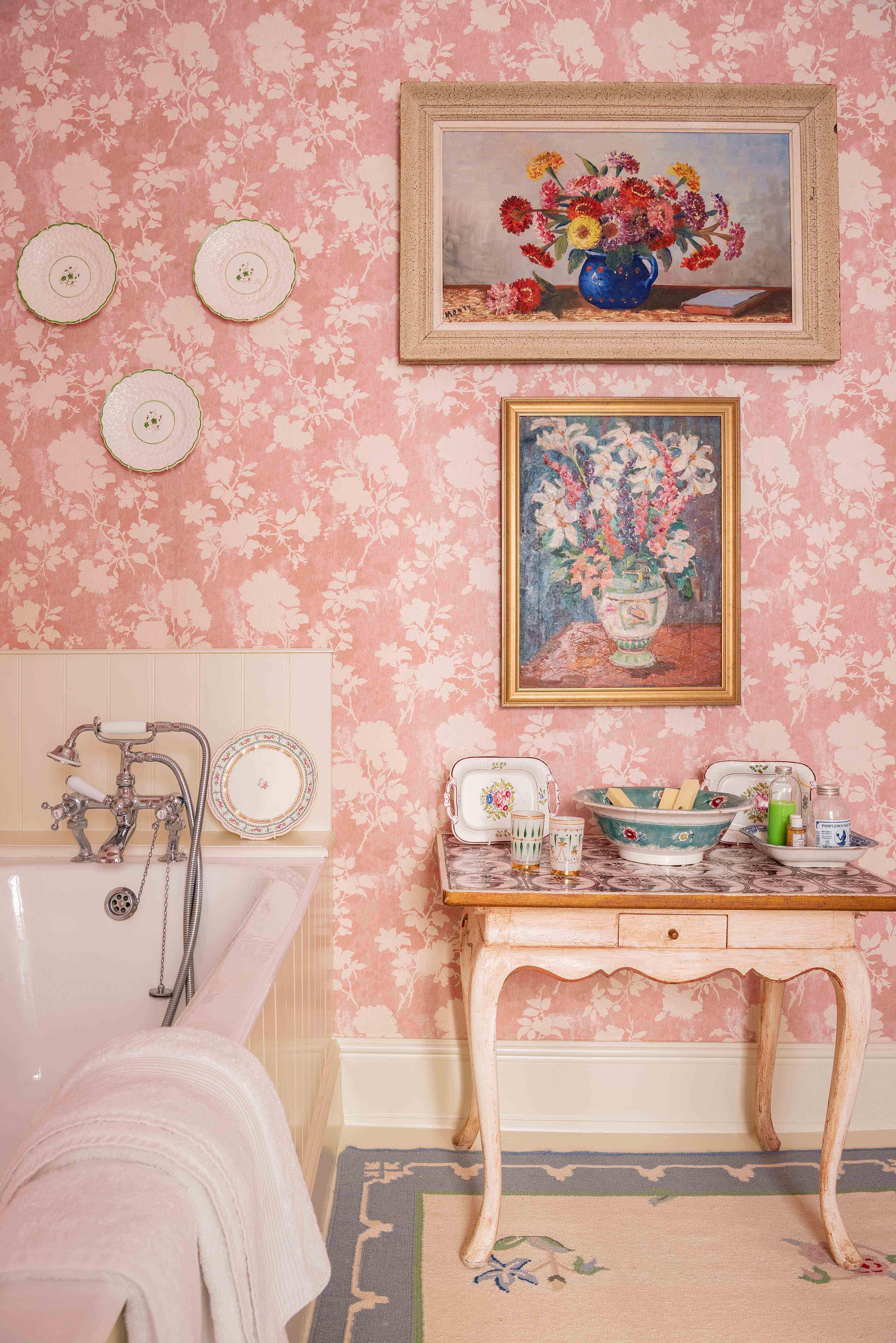
Utilise negative space
If you prefer the effect of wide-width patterned wallpaper, then consider being a little more spartan with your artworks. Aim to space them out enough that a couple of repeats are allowed to show between each frame, and vary the height of your placements to avoid that uniform feeling.
A lot of wallpapers with wide-width patterns make the most of negative space – areas of white or blocks of solid colour between the more intricate parts of the design. Echo that by inserting a generously sized mount into your frames, creating more of a distinction between the wallpaper and the artwork or photograph.
Saturation and Grey Scale
It’s all about avoiding competition between the wallpaper and the art. Whether you’re contrasting scale or finding harmony between the negative space in a print and a frame, it all comes down to maintaining the peace and preventing a clash.
If your room is already bursting with colour from floor to wall to ceiling, then the best way to bring your prints into relief is to remove yourself from the colour spectrum entirely and focus on the grayscale.
There’s no competition between vibrancy and black-and-white, and any brightly coloured wallpaper will mesh perfectly with a display of greyscale portraits, landscapes, and close-ups.
Form with form
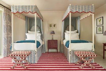
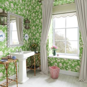
When avoiding conflict between wallpaper and wall art, contrast isn’t imperative. A great way to make everything feel at-home is to marry form with form and echo the shapes found in your wallpaper through your choice of artwork. If you’re decorating with a floral print, then complement it with pressed blooms, or one or two paintings of flowers. The same goes for any other print.
Provided you vary scale between the wallpaper at the artworks you choose, the results can be incredibly effective.
Wallpaper is always a statement piece, in any room. Even if the print is relatively subtle, or the paper is only applied to a small strip of wall – a chimney breast or closed-off doorway, for instance – it makes its mark on the room in a big way. But you needn’t feel intimidated by a wallpapered space when you’ve got frames to hang – just find ways to avoid conflict, and the results will be beautiful.
More from Decoration