Decoration
4 Tips for Decorating Around a Strict Colour Palette
4 Tips for Decorating Around a Strict Colour Palette
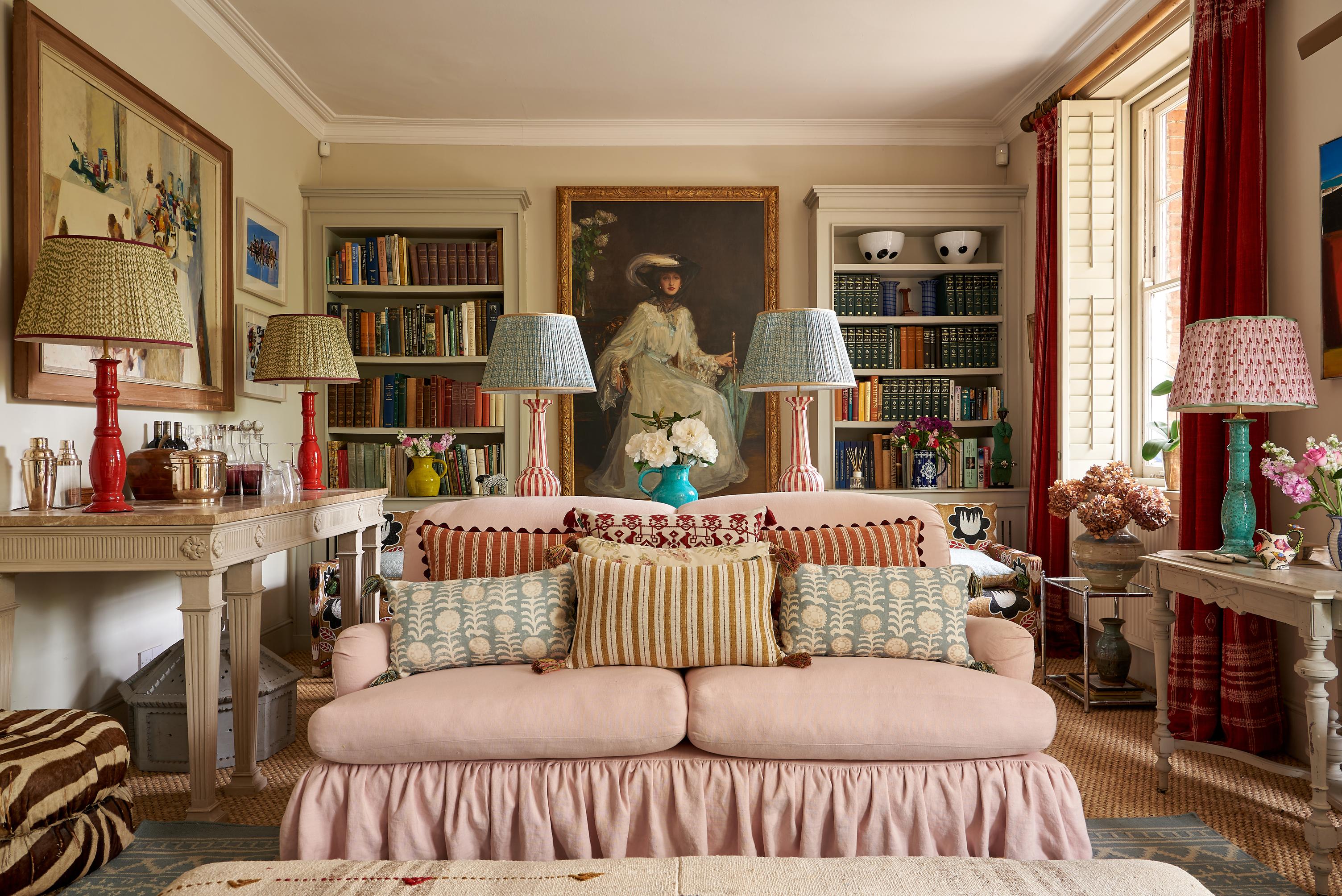
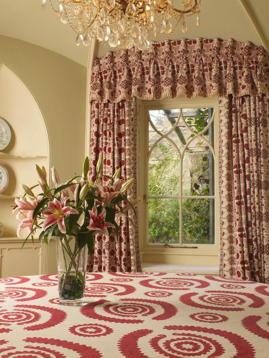
At Penny Morrison, we tend to focus on creating rooms that integrate numerous different design elements together at once. Our own passion for colour and print , and for drawing upon inspirations from across the globe, means that we naturally gravitate toward a more maximalist style of interior design, and make use of all the elements a room has to offer us – whatever room we’re looking at.
Still, there is plenty of beauty to be found in contrasting styles – and even we aren’t strangers to embracing a more limited colour palette. There’s something very tempting about having a ‘green room’, a ‘blue room’, or even a ‘pink room’ somewhere in the home – or, if you really are committed to one hue over all others, embracing it everywhere you turn.
So, while we’re not planning on going fully monochrome – at least not just yet – here are our failsafe tips for working with a reduced colour palette.
1. For Strict Monochrome, Mix Up Your Tones and Shades
Unless you use the same bolt of fabric throughout the entire room, there is absolutely no way you are going to be able to match a single shade of green, blue, red, etc. across your upholstery, your wallpaper, your paint, rugs, decorative accents, and curtains.
The trouble is, slight discrepancies between shade and tone will look unintentional. Introducing more variety (while still sticking to that one colour you’ve chosen) on purpose will show through your décor and make everything feel intentional.
It will also prevent the room from feeling flat, or too encumbered by its own style. Couple that with the added benefit of giving yourself more freedom of choice. There are plenty of blue choices out there, but far fewer options that give you the exact Cobolt you’re looking for.
One of the biggest mistakes we can make is assuming that the colour we buy our sofa in will ‘just happen’ to pop up again in our furnishings, fabrics, and paints in the future. Even if the colour code is replicated, different materials and textiles will ‘wear it’ differently, so, at the risk of sounding pessimistic, just don’t bother.
2. The Rule of Three is always Handy
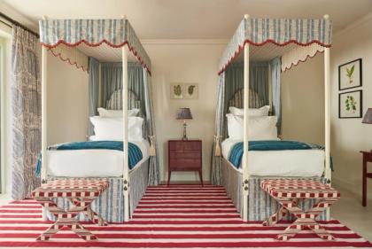
If you’re not going full monochrome, but still want to centre your room around a very specific colour palette, consider embracing the rule of three. Designing a room around two different colours is still very restrictive, and it can start to make the room feel more commercial (think office space) than homely.
Integrating a third colour into the mix – and, ideally, one that contrasts effectively with the other two – is a very good idea. A combination of sage and grey is very popular right now, and a surprisingly effective contrasting colour can be found in a rich, Mediterranean terracotta or pumpkin hue.
Use the colour wheel to your advantage and remember that the best contrasting colours will be a different tone to your other, primary colours. Pair pastel with richness, matte with gloss, and dark with light. It will make every colour stand out more in its own right.
3. Don’t Shy Away From Pattern
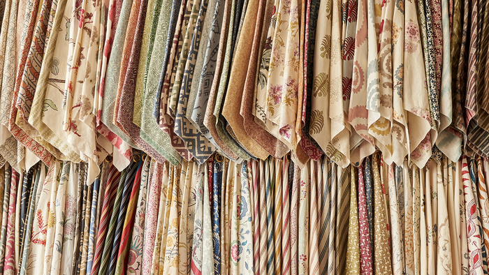
Colour blocking is great, but we’re a fan of the effect created by a healthy mix of the colour block and the pattern. True, finding the right prints may become slightly tougher the more restrictions you impose on colour, but it’s still possible.
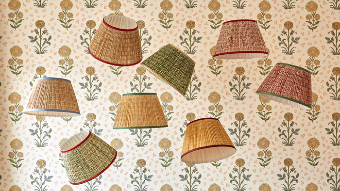
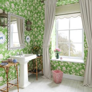
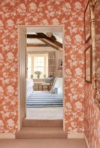
Our Flowerberry Green wallpaper is a great example of the power a single-colour print can wield over a room. A print like this – something that varies shape and utilises white space as much as possible – can mean the difference between a room feeling stuck in its own rut, and a room feeling as though it’s just as creatively put together as a space that features ten times as many colours.
4. Incorporate Texture as Much as Possible
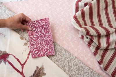
This is another way of avoiding that flat, featureless vibe that a room too attached to its own small colour palette can end up with. Fabrics and wallpapers are always going to add colour and print to a room, but texture is arguably just as important for creating that sense of variation that you are limited on if your colour palette is strict.
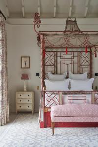
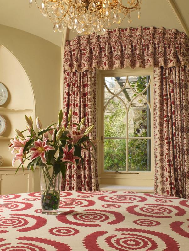
Natural fibres like linen and cotton give a great texture, while an abstract woven wallpaper, like our Nankeeng Pink wallpaper, will make a major difference to the overall impression the room makes, and how luxurious it feels.
More from Decoration
