The Penny Morrison Guide to Using Floral Wallpaper
The Penny Morrison Guide to Using Floral Wallpaper
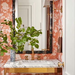
If there is one theme that really needs no introduction whatsoever, it’s floral. Not only has it been explored countless different within a multitude of art movements, but it’s also a theme that has found lasting popularity around the world, in so many different cultural art styles. For that reason, decorating with florals is a big subject – one that lends itself to almost any design aesthetic or taste.
In the past, florals have come under scrutiny. True, florals for spring may not be the most ground-breaking suggestion ever made, and certain styles of floral are now irrevocably tied to very particular trends in fashion and interior design, but their versatility is what keeps them fresh.
Form, Shape, Texture, Size…What are the Elements of Floral Design?
Some floral styles have earned recognisable names over the years. The fleur-de-lis is an obvious example of this. But, with so much left open to creative interpretation, it would be impossible for every floral pattern to earn a name with that same level of recognisability.
But, saying you want a ‘floral wallpaper’ will only get you so far. Eventually, you need to pin down what you want from that floral, and this is why it pays to think about florals in terms of the different elements. These elements vary from person to person (and depending on what the florals are designed for) but, for wallpaper, it’s helpful to think about florals according to:
Style comes first on the list since this is the most significant influencing factor when decorating any room. Start by thinking in terms of contemporary vs classical – whether you want to embrace the intricate, busy florals that suit rustic cottages, or something a little more abstract, a little bolder, or a little less detailed.
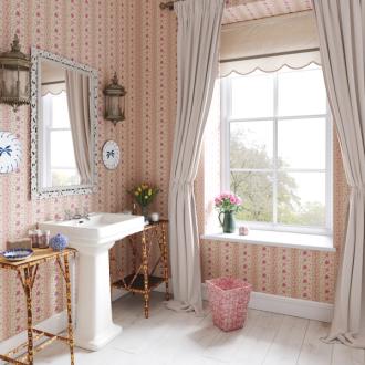
Colour is, for obvious reasons, the next consideration. If you’re looking to , then you won’t need to worry too much about sticking to a specific colour scheme – but, for the rest of us, working to a rough colour story is one of the easiest ways to whittle down your options, and avoid feeling overwhelmed by choice.
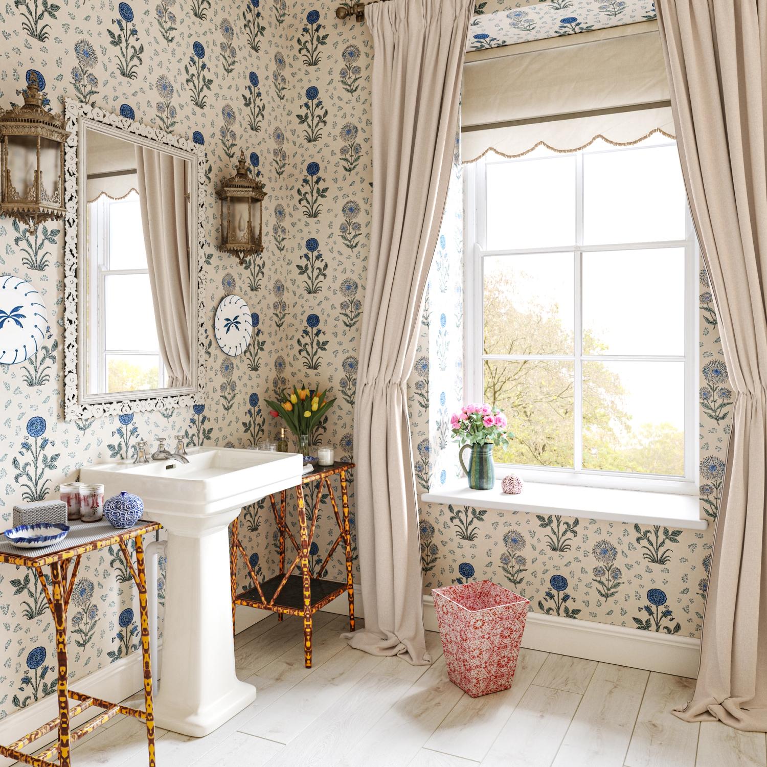
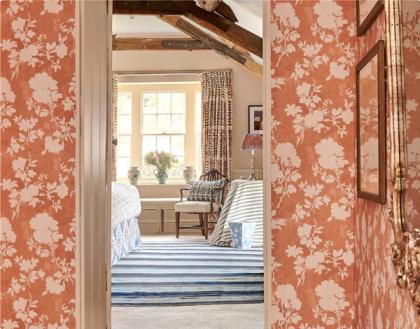
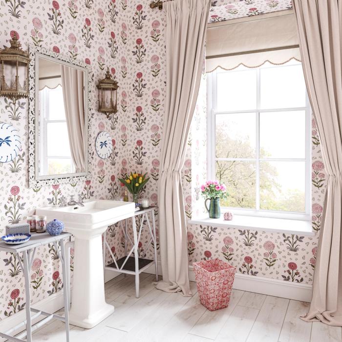
Space is key. It’s not just about the flowers themselves, but about the amount of space that exists between them – particularly when you’re looking at florals for the walls. ‘Negative space’ – or, in other words, just the ‘unused’ space within the pattern itself – is very useful for changing the impact a wallpaper has on a room. More negative space generally equates to a more understated feel (and often pairs well with a more contemporary aesthetic), while patterns with little to no negative space generally appear a lot more traditional and cottagey.
Texture doesn’t need to be interpreted in the literal sense. While some wallpapers – particularly woven, uncoated papers like ours – have a slight natural texture to them, it’s just as important to consider the sense of texture your pattern will bring to your room. In most cases, smaller patterns with more intricate details will introduce a greater sense of texture, while the simpler papers with more negative space will look a little flatter.
This flatness isn’t a negative. It suits plenty of styles and helps to avoid a slightly more minimalistic room from feeling too ‘heavy’ with detail and decoration.
Size is also key. Most wallpapers come with a ‘pattern repeat’ measurement, which simply lets you know how much (or little) space a single repetition of the pattern will cover. It’s worth ordering samples of any wallpaper you’re considering before you make up your mind, but the repeat will be a useful guide in the first instance.
Three Tips for Making the Most of a Floral Wallpaper
1. Embrace the Silhouette for a Low-Commitment Floral
While it’s a lot less cut-and-dry than it used to be, florals are still sometimes associated with a more feminine style. In a lot of instances, this needn’t be an issue – but, if you want to avoid it, taking advantage of the silhouetted floral can prove highly effective.
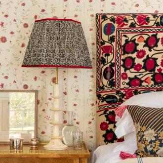
Our Flowerberry Wallpaper, for instance – click here to see it in Green – captures the organic, romantic shapes of wild-growing flowers, but omits any other details. The result is something that will prove more versatile if you are unsure about committing to the more ornate, feminine florals.
2. Use it as an Excuse to Leave Colour Open to Interpretation
One of the most convenient traits florals offer is their open-endedness when it comes to colour. True, plenty of florals are designed around a particular colour scheme, but plenty more embrace the full spectrum of colours found in any space left to grow wild.
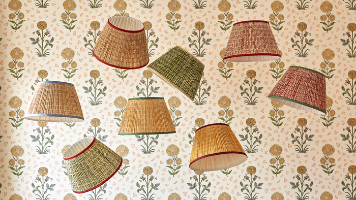
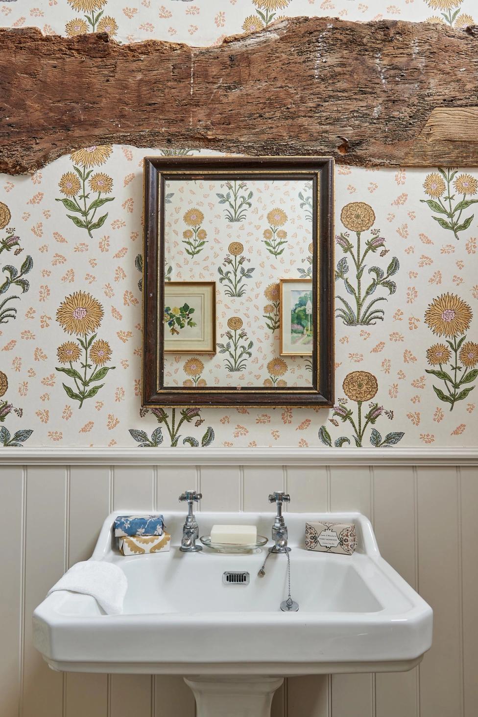
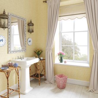
The primary colour for this Magda Yellow Wallpaper is yellow, but the print also features touches of green, pink and orange. If you’d rather not tie yourself into a very prescriptive colour palette, then a paper like this will make it easier to introduce more complementary colours through your furnishings and accessories.
3. Explore the wilder side of florals for a less structured feel
In patterns with a lower repeat measurement, it tends to be easier for the eye to ‘spot the pattern’ very quickly. With the flowers (or any shape) arranged in a very precise sequence, the effect is pretty orderly and relatively simplistic. This is a very useful effect of balancing the detailed shapes of flowers with a more structured arrangement, but it’s not the only way to do things.
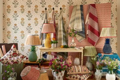
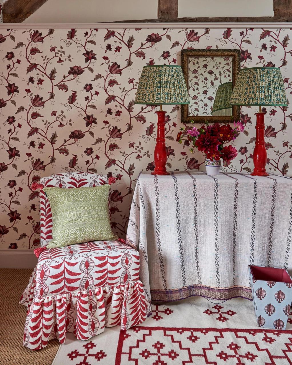
For example, our Bengal Garnet Wallpaper features a much larger vertical pattern repeat at 65cm. This, combined with the wilder print made up of a variety of shapes, leaves, stems and flowers, will in turn create a much less structured look on the walls.
At Penny Morrison, we love the beauty and elegance a floral wallpaper can introduce to a space, and you can take a look at our full range of floral patterns here.
