The Penny Morrison Guide to Using Abstract Wallpaper
The Penny Morrison Guide to Using Abstract Wallpaper
Abstract prints and patterns are, in many ways, the all-rounders of interior design. While most of us will probably associate them with contemporary, minimalistic styles more readily than we will associate them with any other approach to interior design, the reality is that abstract designs come in – and work for – many different styles.
The truth is, ultimately, in the name itself. The style is dictated by the whoever makes the art, meaning that it’s a lot more open to interpretation than some other art styles out there. Abstract features can command a lot of attention, but they can also act as an attractive though undistracting backdrop to the rest of the room.
With (generally) fewer intricate details and good versatility when it comes to colour, these wallpapers are some of the most useful for transforming a room without dictating how the rest of the décor should look.
First, what Type of Abstract?
The heightened versatility of the abstract is also one of the things that can make it harder to pin down what it is you want. Deciding to use a floral wallpaper, for instance, is relatively straightforward, since ‘floral’ will put you on a very specific path (even if that path brings with it plenty of choice). Deciding to use an abstract, however, means that your list of options remains very wide. There are abstract geometrics, abstract florals – even abstract animals and other shapes.
In all likelihood, this first decision will likely prove the hardest – unless, of course, you leave yourself open to any type of abstract, and simply go by your own tastes, waiting to see what appeals.
Next, Consider Size and Negative Space
Most people, when they think of abstract patterns, will picture the larger prints. What comes to mind are the big, arresting shapes and brushstrokes seemingly thrown together like Picasso or Kandinsky – and, while this is partly true, there’s a lot more to it than that.
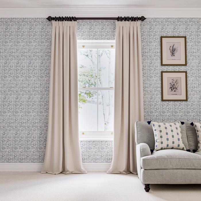
Some of the most effective abstract wallpaper designs don’t utilise every inch of space available to them, but use negative space (the seemingly unused areas within the print) to create unique shapes, and a more subtle source of texture and colour. This is particularly useful for smaller rooms that, in general, would struggle to accommodate a particularly large abstract wallpaper. It also makes it easier for you to hang pictures and shelves on the walls without them looking as though they are awkwardly perched atop the wallpaper.
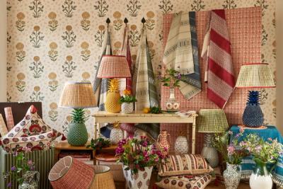
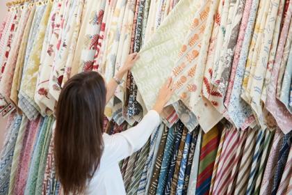
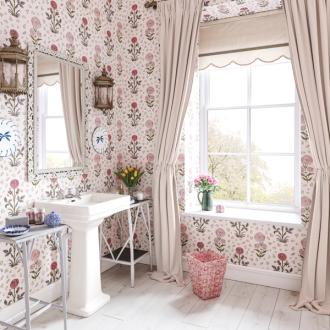
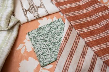
Our Pasha Sprig wallpaper in soft green, for instance, features a relatively small and delicate design, but a large part of what makes it so effective on the wall is not just found in the shapes those abstract sprigs create. The abstract shapes created within the negative space – by the interplay between green and white – adds a lot of texture to a room without commanding all the attention.
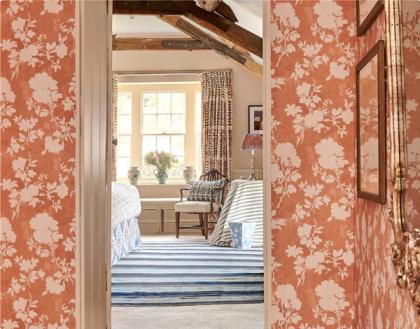
You can see a similar effect in our Sunda Wallpaper – shown here in brown. Featuring a combination of abstract and geometric shapes, negative space within this paper is just as effective at creating abstract and unique shapes as the print itself. As your perspective shifts, so does the impression created by the Sunda print.
The key takeaway from this section is the fact that the size of the pattern itself is only as important as the power of the negative space. Larger abstract prints tend to carry less negative space, so the pattern itself has more power; smaller abstract prints tend to feature more negative space – so, while the pattern itself will have less power, the negative space will have more.
While true for any pattern, this rule of thumb tends to prove most effective in abstracts, where shape is key.
3 Tips for Making the Most of an Abstract Wallpaper
Abstract wallpaper speaks for itself but, as always, there are plenty of ways to really make it sing. Here are a few of our favourite ideas.
1) Use it abstractly
In recent years, we’ve seen a lot of new painting trends emerge on the scene. While, before, interior designers might have used existing features as an excuse to introduce contrasting paint or wallpaper – for instance, an alcove in the wall or an area that falls above or below the dado rail – they are now in favour of creating those shapes themselves.
While using colour blocking is more common, there is no reason why you can’t do the same with your wallpaper. Rather than working with the wall’s existing features, create a new shape against the wall and ‘carve it out’ using your wallpaper placement. It will take a little extra skill, but the results are very effective – especially for abstract styles.
2) Contrast abstraction with realism
Abstract design is the antithesis of realism – and, while they might be polar opposites, the two pair with one another surprisingly well.
So, if you’ve papered a good expanse of wall, consider introducing contrast through your wall-hangings. A couple of hyper-realistic paintings or prints – preferably in colours that pop out against the wallpaper – will help to elevate the impression made by both your wallpaper and your chosen artwork.
Indeed, you may have opted for an abstract animal or floral pattern. Designs that embrace both abstraction and realism. Distilling the abstract floral print into a photo-realistic piece of art hung on the wall may offer an effect similar to how lenses remove blur. You’re taking artistic representation and photographic representation – two opposites – bringing them together.
3) Echo it in another part of the house
We’re not suggesting that, when you pick out a wallpaper, you’re committing yourself to using it in every room at the exclusion of any other wallpaper or colour scheme. Instead, we’re saying that finding small ways to use it elsewhere can be very effective for tying a space together.
As we mentioned earlier, abstract patterns can be a little subtler than more realistic patterns, which makes them blend into the rest of the décor a little easier. As a result, this affords you more freedom, making it a great element to repeat throughout multiple rooms.
